Web Application Design for uWork AS
uWork is an innovative online staffing agency that connects companies with Norway's best therapists, nurses, educators, and other healthcare professionals.
- Product Design
- Design System
- Branding
Timeline
From late 2018 - early 2020
Tools
-
 Figma,
-
 React,
-
 Tailwind,
-
 Illustrator
Services
- Product Design
- Design System
- Branding
Links
Project Overview
uWork started in 2016 as a healthcare staffing agency. With the ambition to embrace digitization and revolutionize their operations, uWork partnered with the skilled professionals of the Ornio team. In this collaborative effort, I was tasked with solving complex UX/UI problems and I was also responsible for the look and feel of the product for which I created a new visual language and led the redesign of the entire platform.
Main project goal
The most important goal for this redesign project was making the UX design extremely clear. The process of hiring healthcare professionals and healthcare professionals applying for jobs needed to be super simple. All this needed to tie back to the new style we created for the platform.
The old version of the platform was characterized by boxes with long shadows, giving a feeling of outdated design.

In contrast, the new design embraces a minimalist approach with a cleaner and more modern layout.
Flowchart & Sitemap
Once the content and functionality of the platform were defined, we started to structure that content into increasingly granular flows and diagrams. We tried to understand which actions and elements had greater importance and relevance as it was essential to define priorities to achieve a platform that had more intuitive user flows.
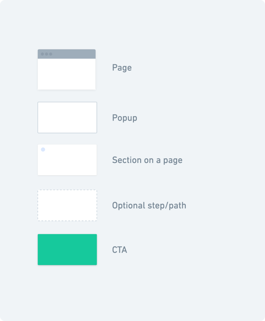
Symbols that represent the different types of actions or steps in the process.
Foundations
Furthermore, we have set some foundational elements that form the core of uWork’s design system. These foundations include elements such as color palette, typography, spacing, icons etc., that we used to build product screens and scalable design components for the platform.
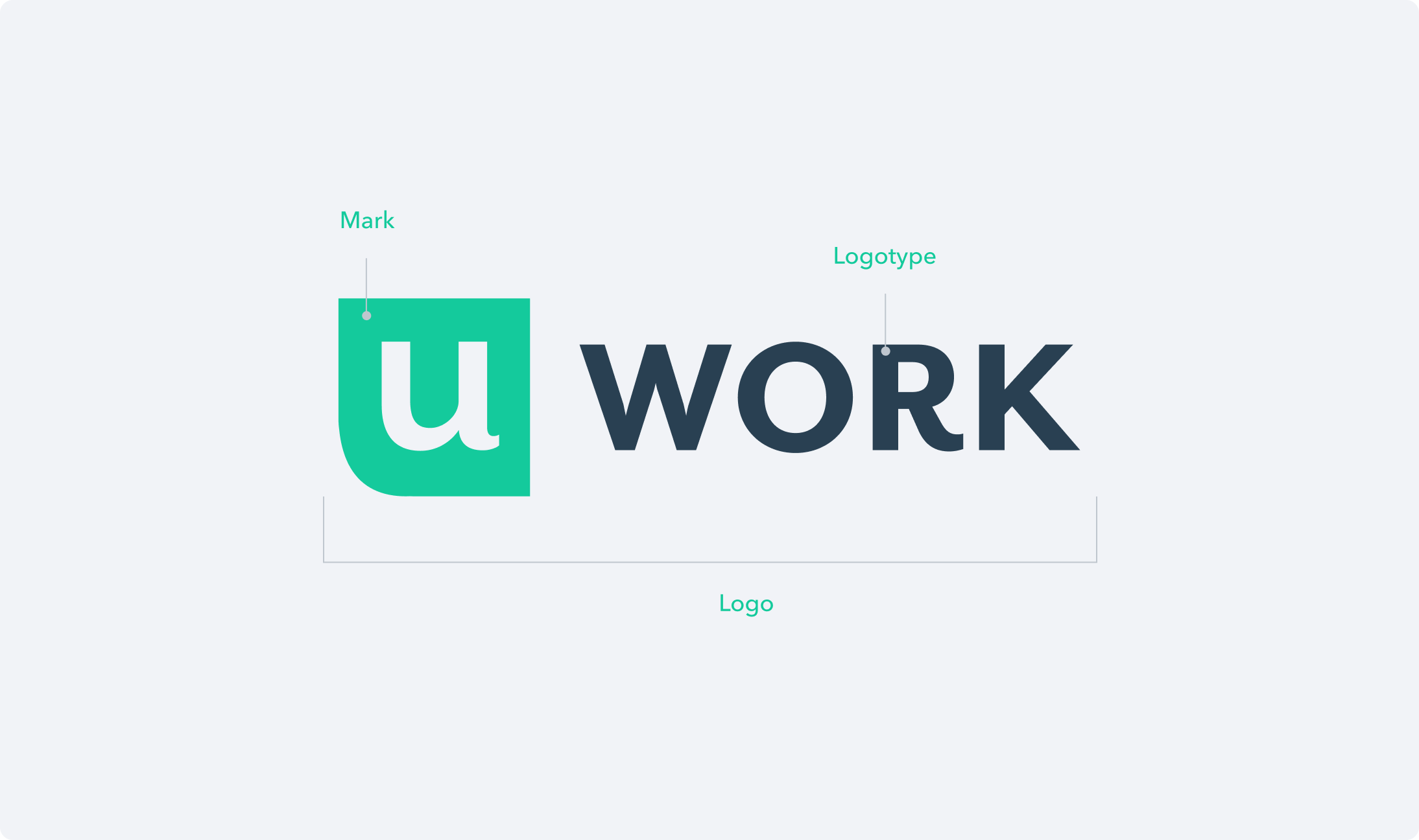
uWork’s digital identity includes the mark and the logotype.
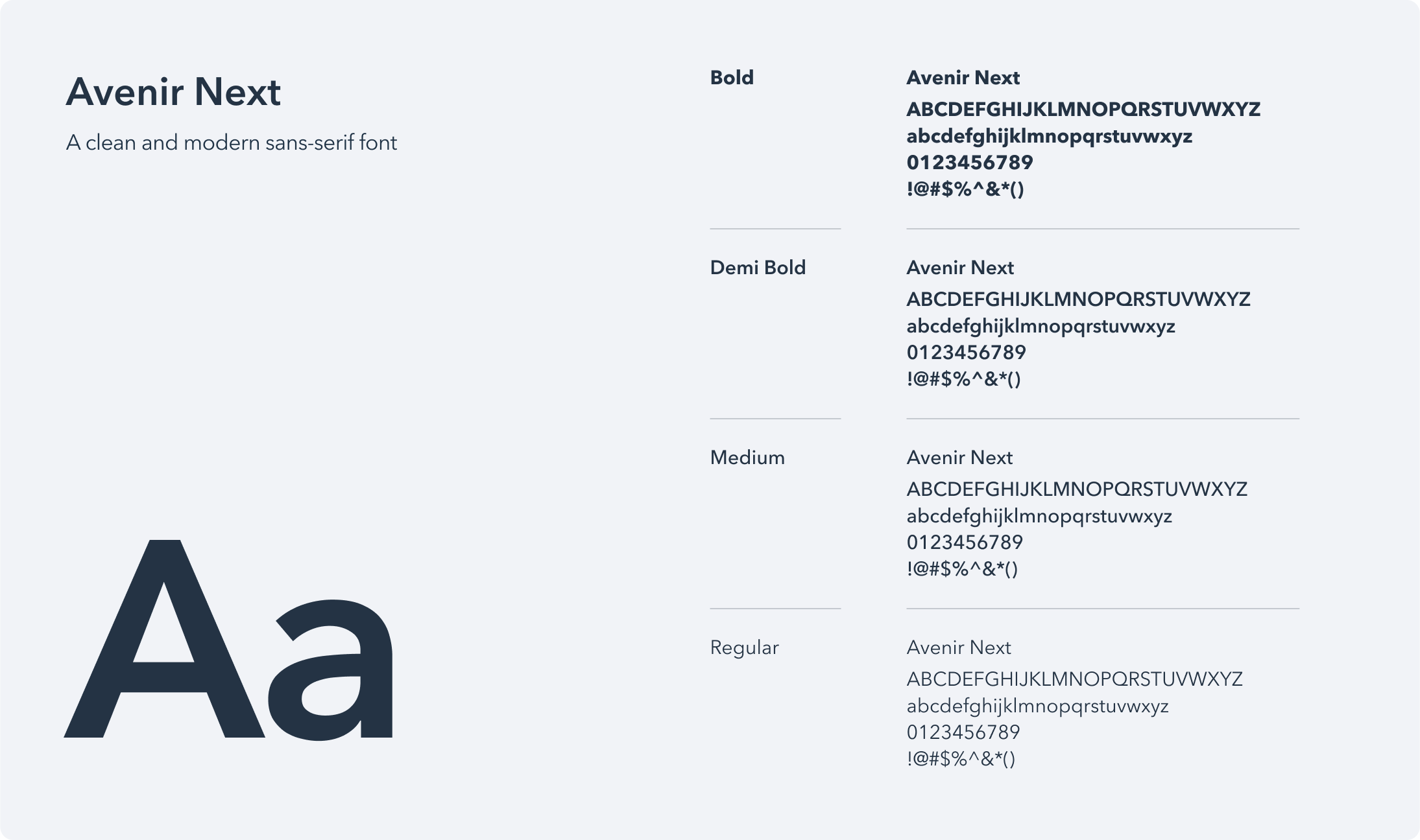
uWork's primary typeface is Avenir Next — a robust typeface with legible numbers that renders well at all sizes.
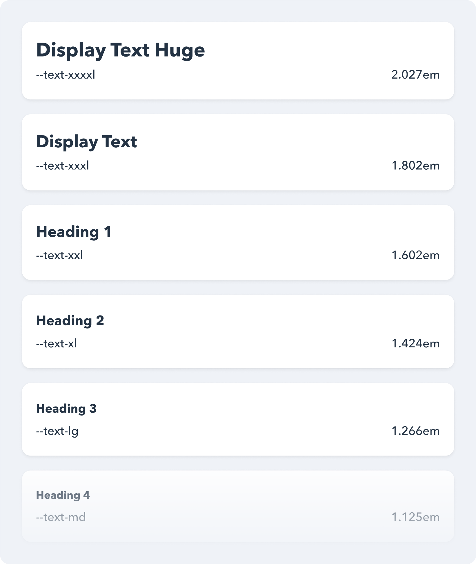
Major Second (1.125) is the low-contrast type scale that has been chosen for this project.
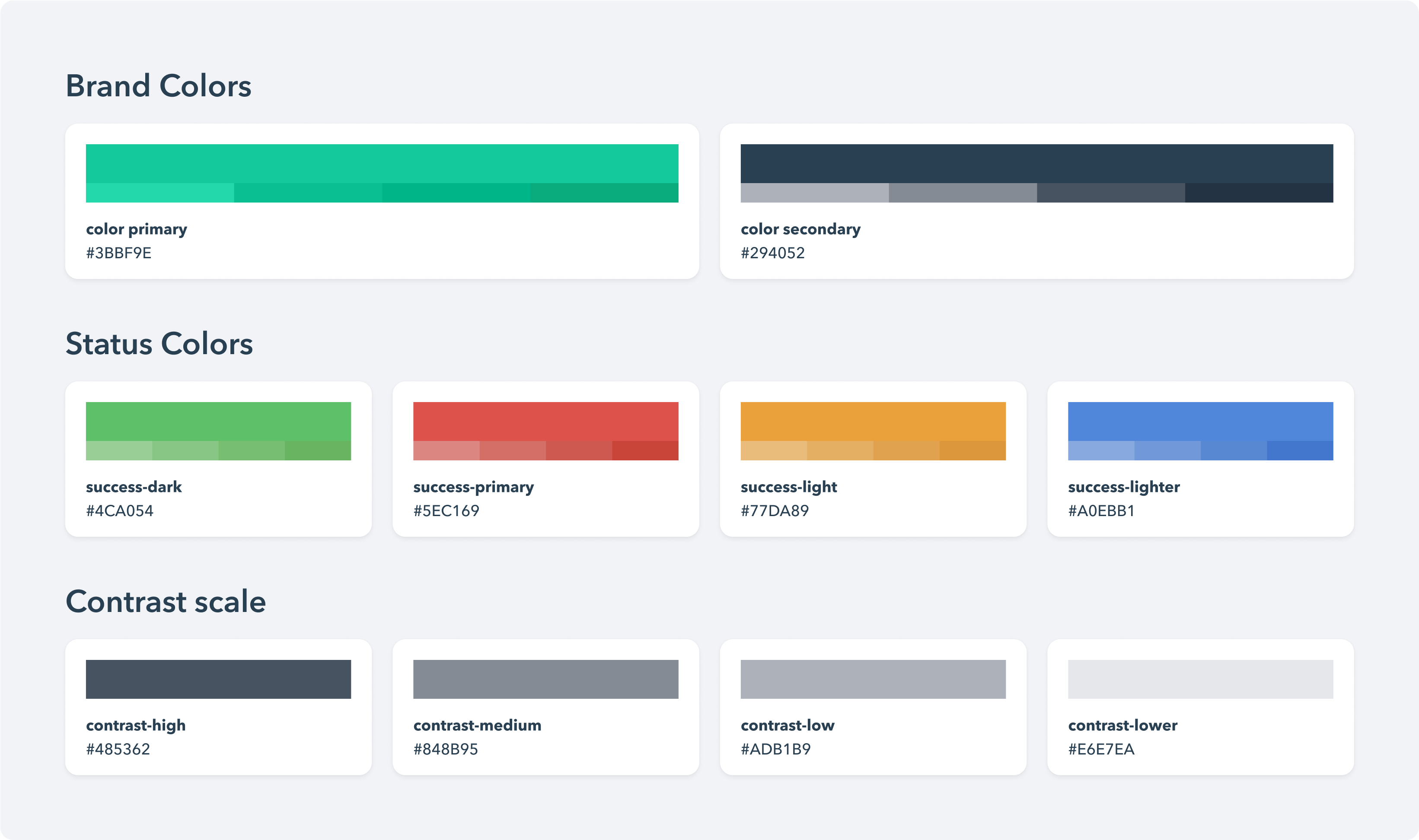
The color palette that distinguishes uWork brand and helps create a consistent experience across the platform.
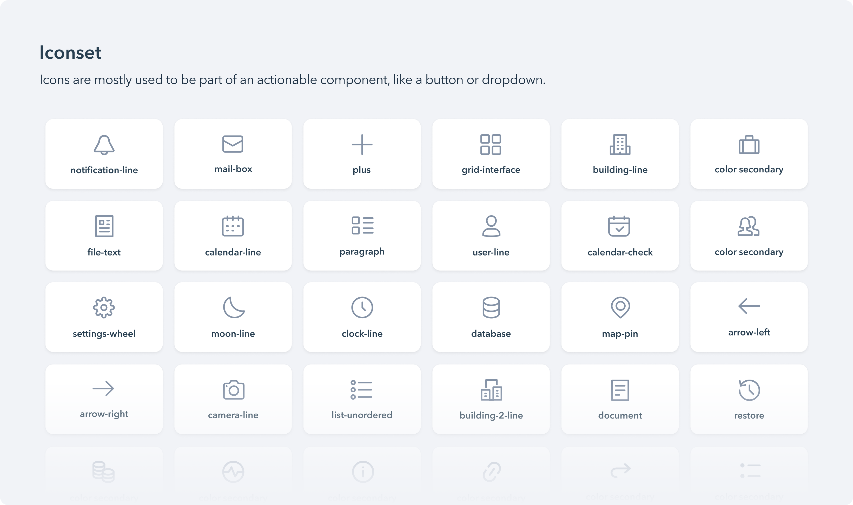
The iconset that has been used for visual representations of commands, devices, directories, or common actions.
Layout
We have designed and configured several components that control the layout, such as: grid, layout, spacing scale, etc. All these components, when they come together, build up the layout and bring consistency and visual coherence to the pages.
A grid independent of the sidebar that allows elements to span across 12 columns of the available horizontal space.
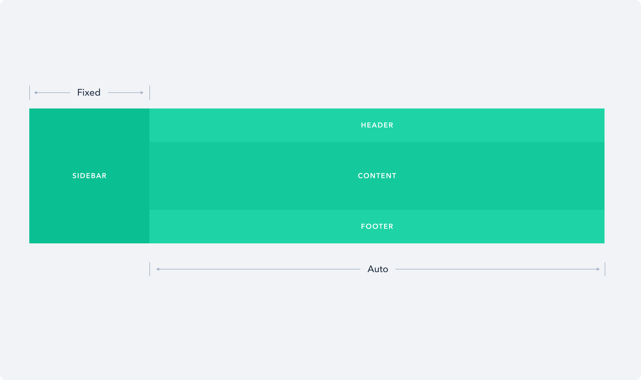
A fundamental layout component that inculdes a sidebar, a header, a footer and the content area.
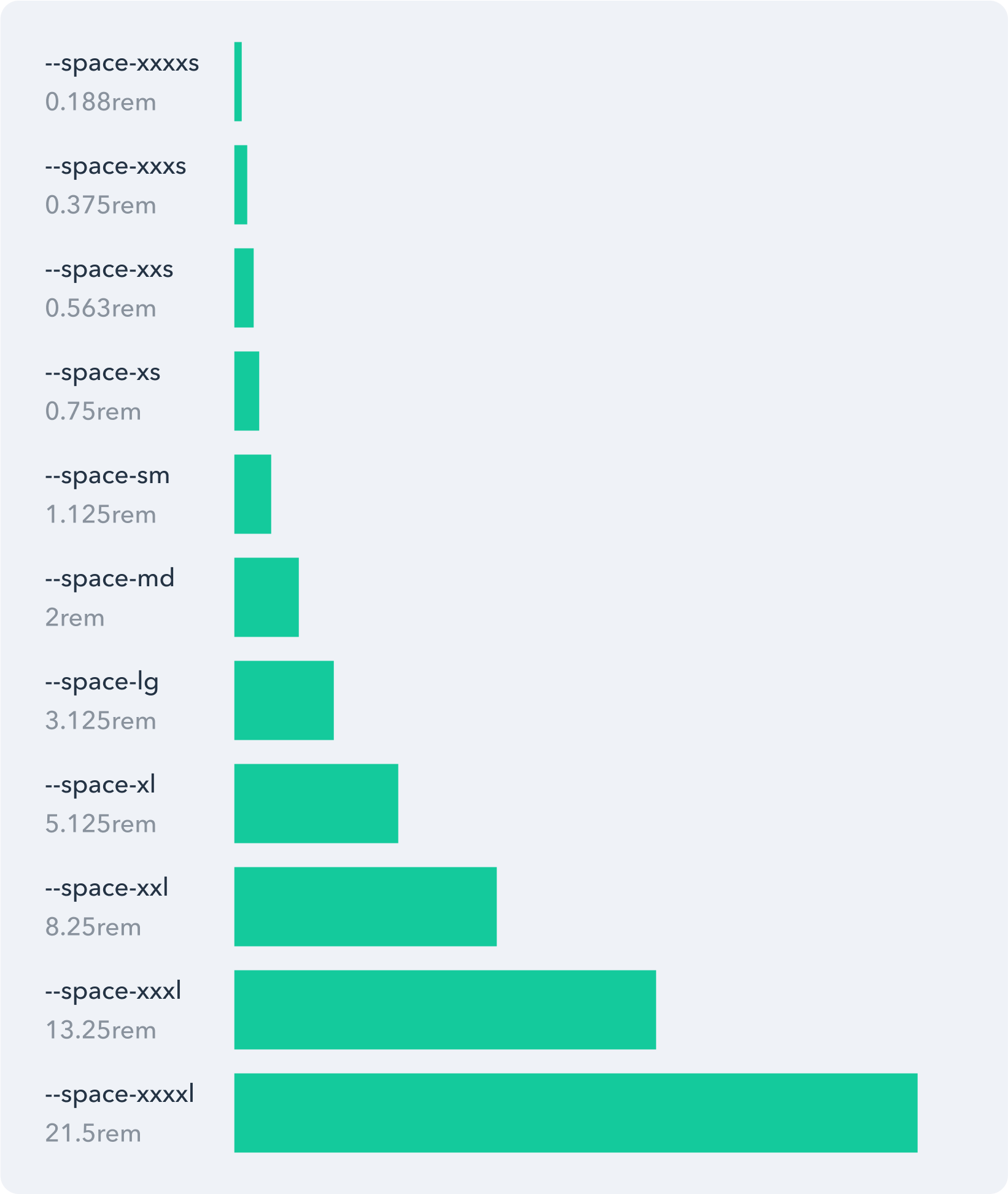
The spacing scale system that simplifies the creation of page layouts and components.
Navigation
To enhance user mobility within the platform, we've developed a range of intuitive navigational elements. These components offer users convenient access to various app pages or sections and enable seamless navigation to previous pages.
A navigation bar — known as the steps — that guides users to perform tasks following a predefined workflow.
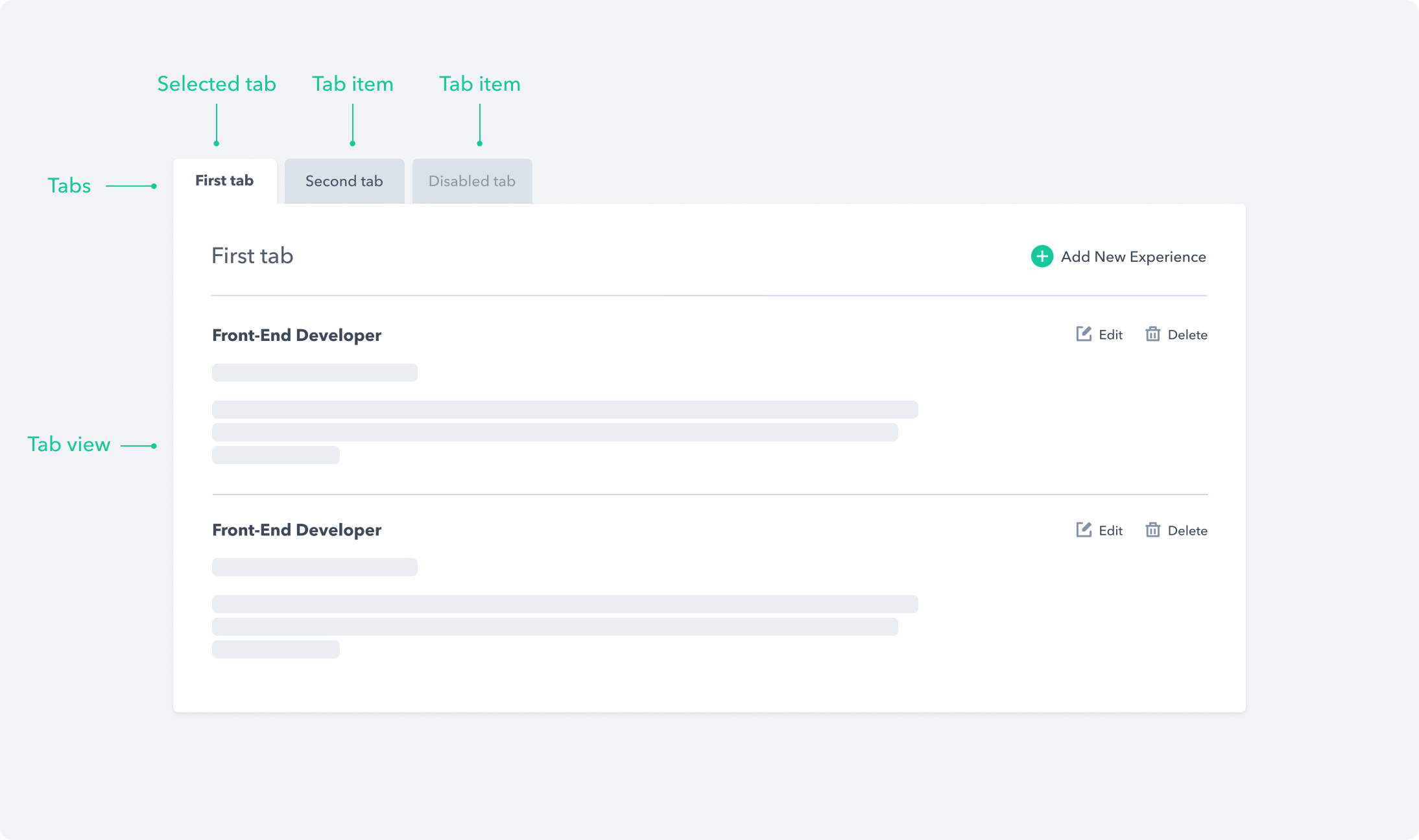
A set of layered sections of content — known as tab panels — that are displayed one at a time.
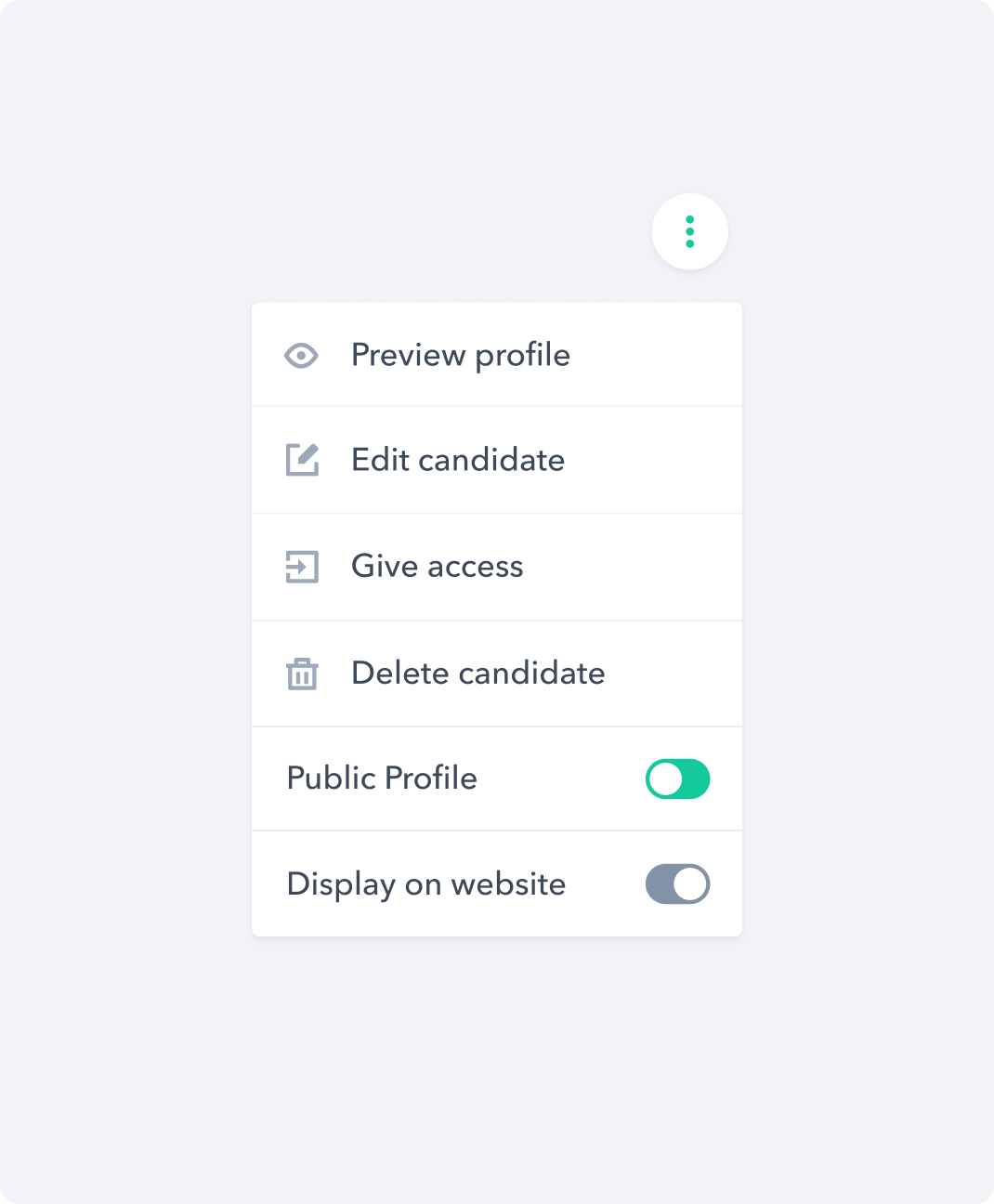
A popover menu component that opens on demand.
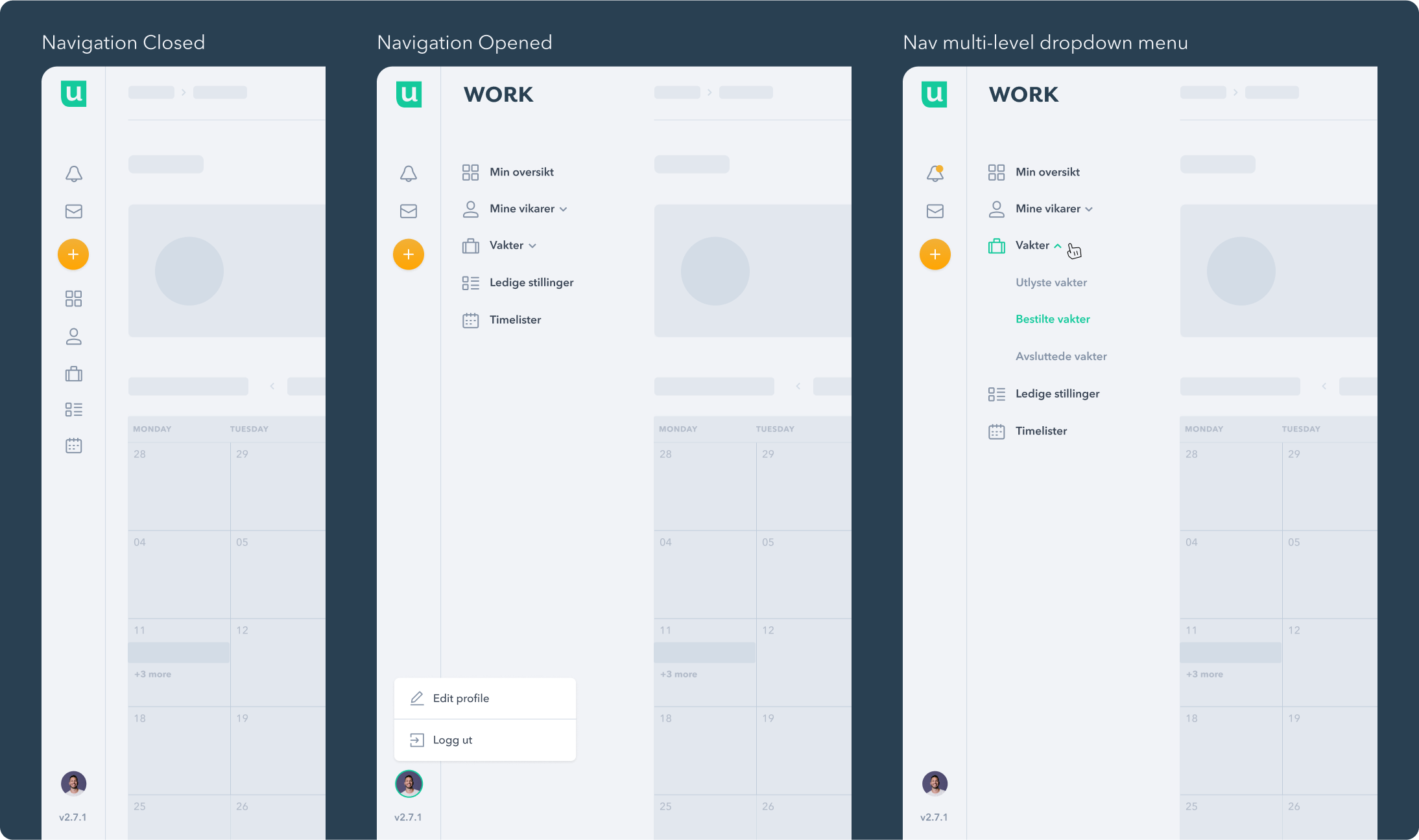
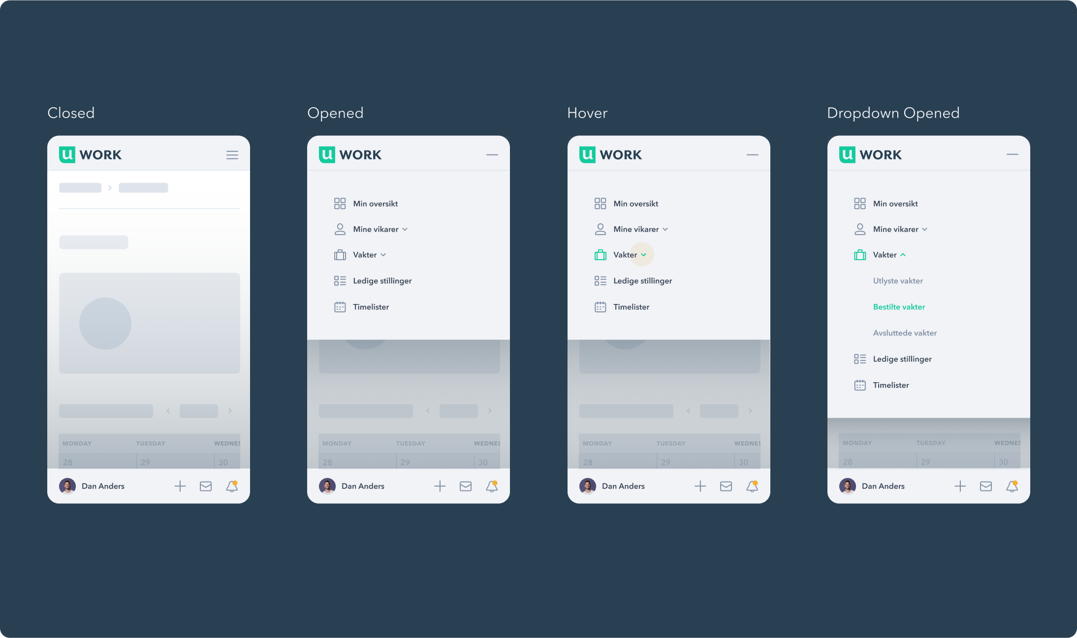
A highly composable side navigation component that is suitable for multi-level operation.
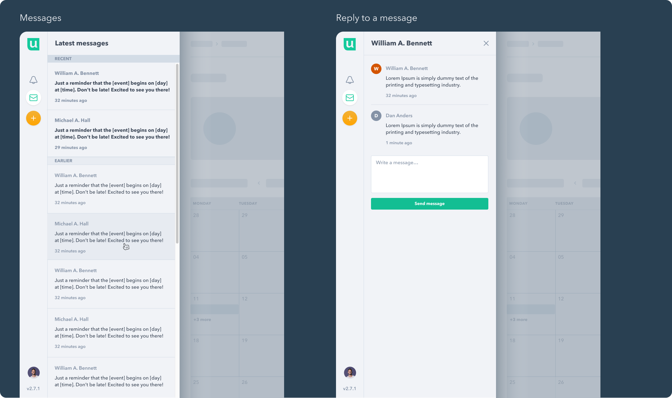
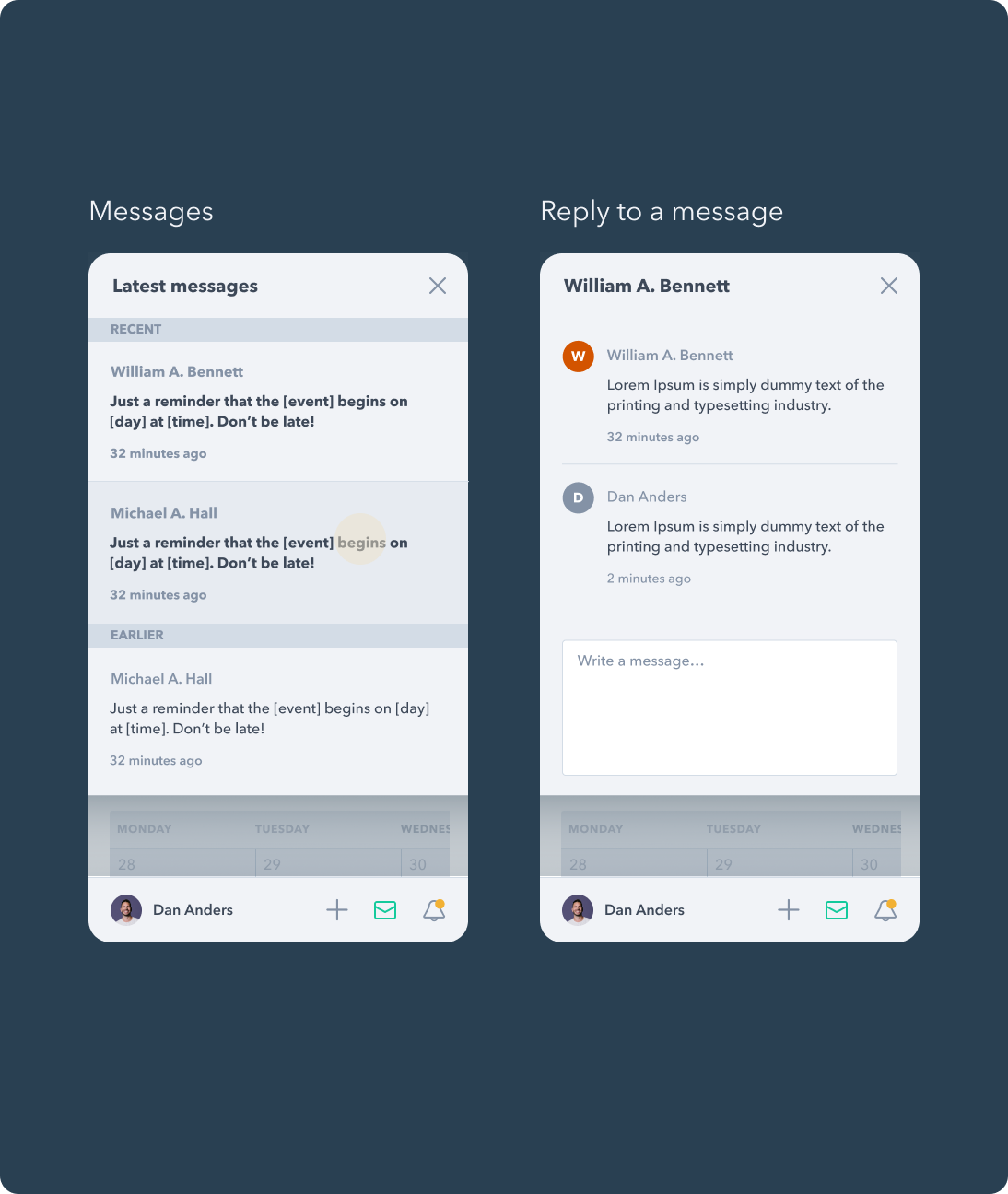
A highly composable side navigation component that supports viewing and replying to recent messages.
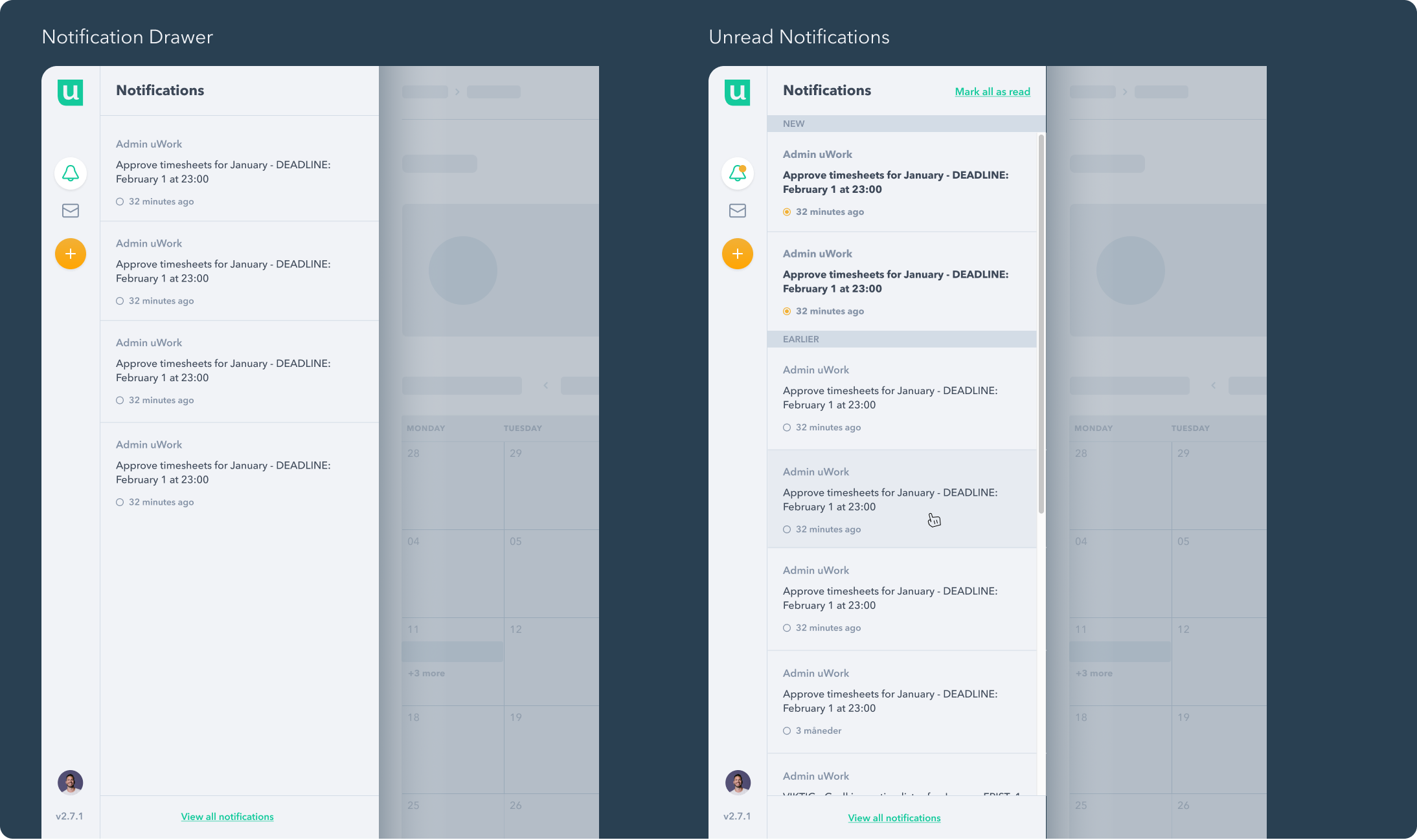
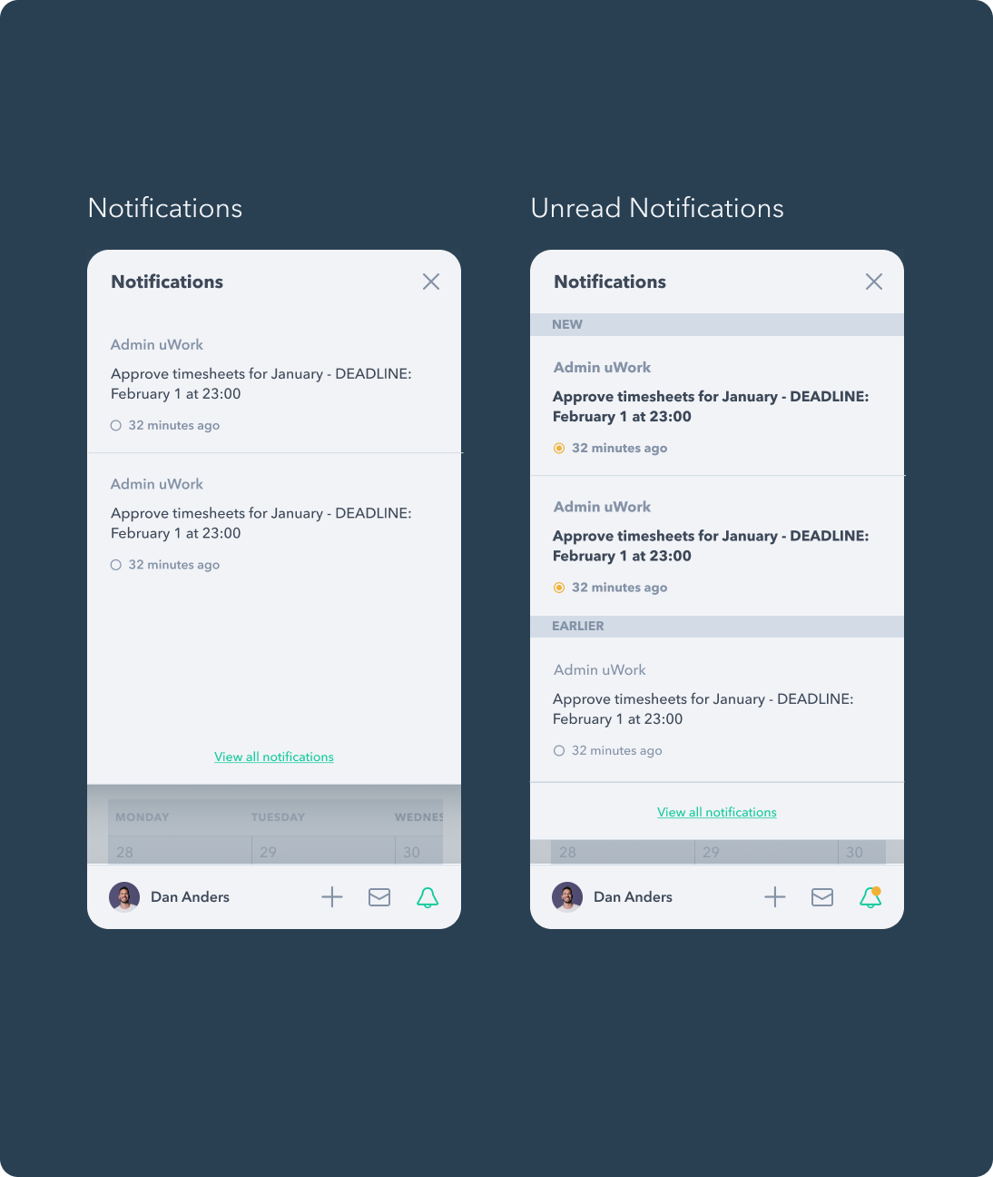
A highly composable side navigation component that supports viewing read and unread notifications.
On the platform's desktop version, the sidebar serves its navigation purpose by giving the user quick access to its core pages. To allow the user the same level of practicality on mobile devices, we transformed the sidebar into a top menu for core pages and a bottom menu for frequently used actions, ensuring easy access with a simple touch.
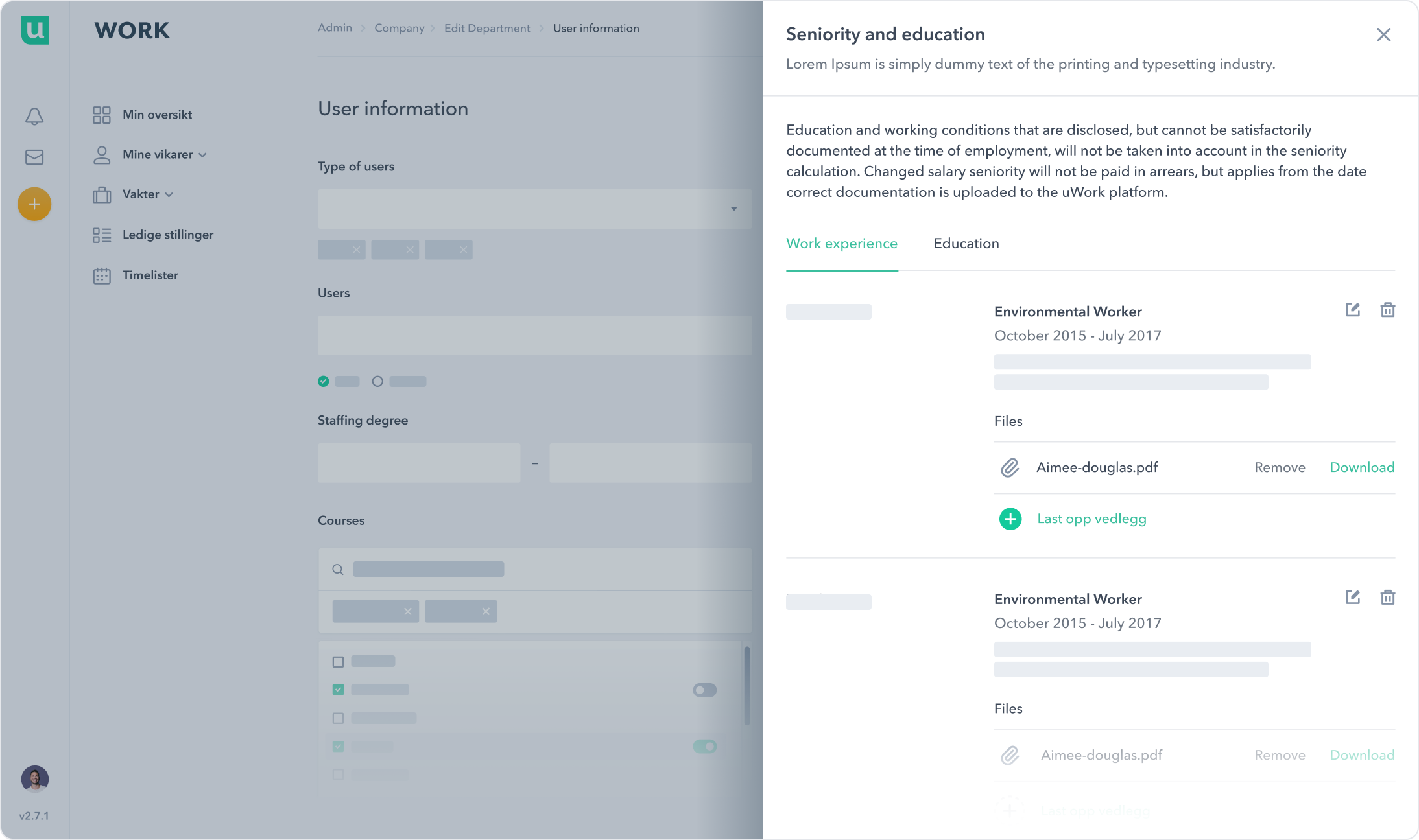
Data Entry
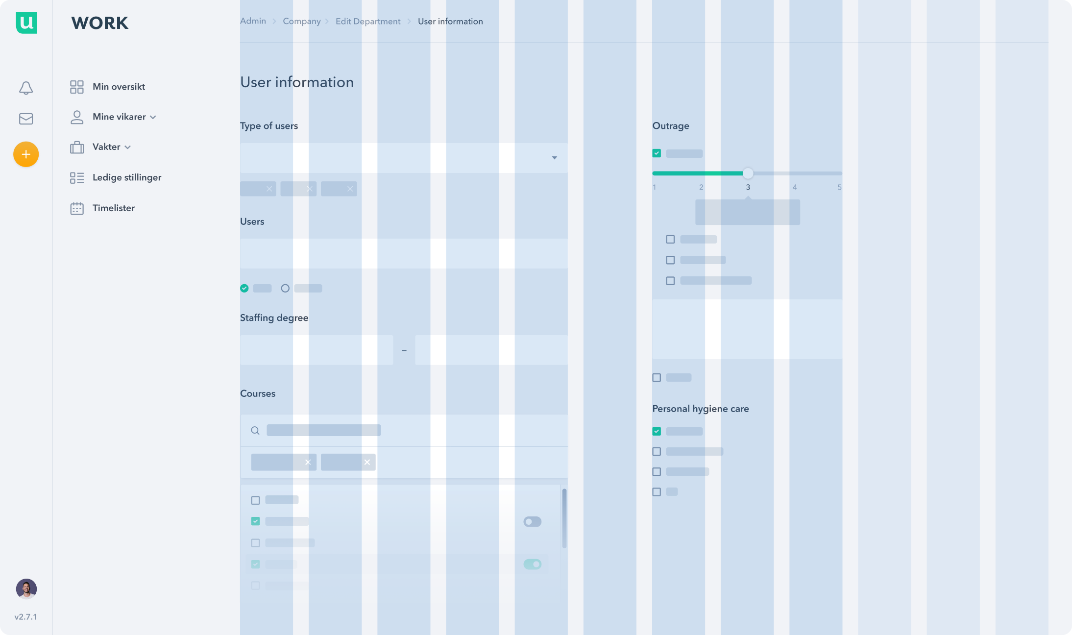
Our efforts were focused on creating a diverse range of Data Entry components. These components have been designed to accommodate the multifaceted needs of users when interacting with the platform. By offering various text input methods and selection options, we empowered users to perform actions with clarity and efficiency.
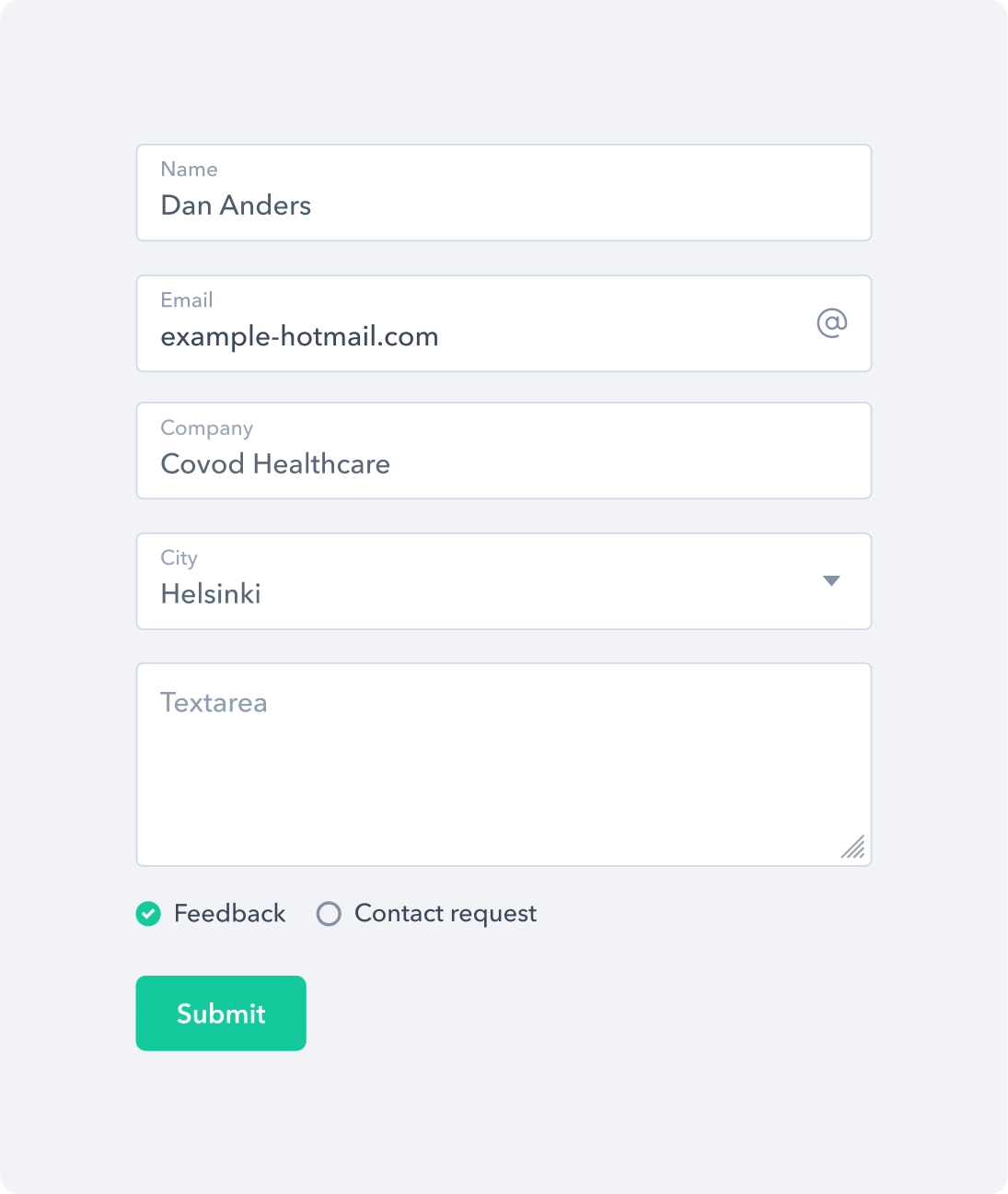
A form control component that features a collection of fieldsets and inputs.
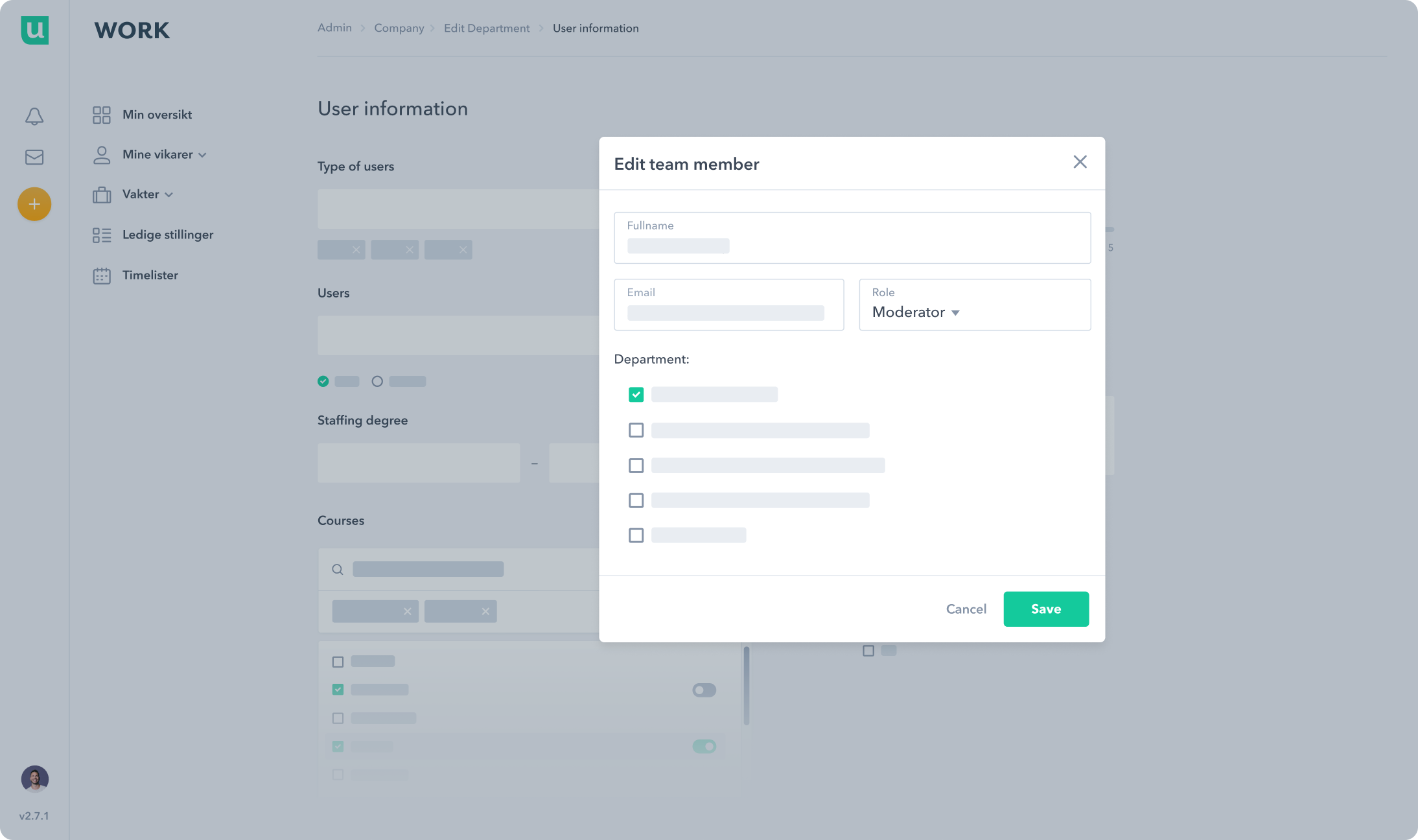
A modal component shown as a content container that gathers information without losing context of the underlying page.
A functional component called 'Editable Table' that enhances tabular data with editable possibilities.
A Drawer component that overlaps on top of a page and slides in from the side.
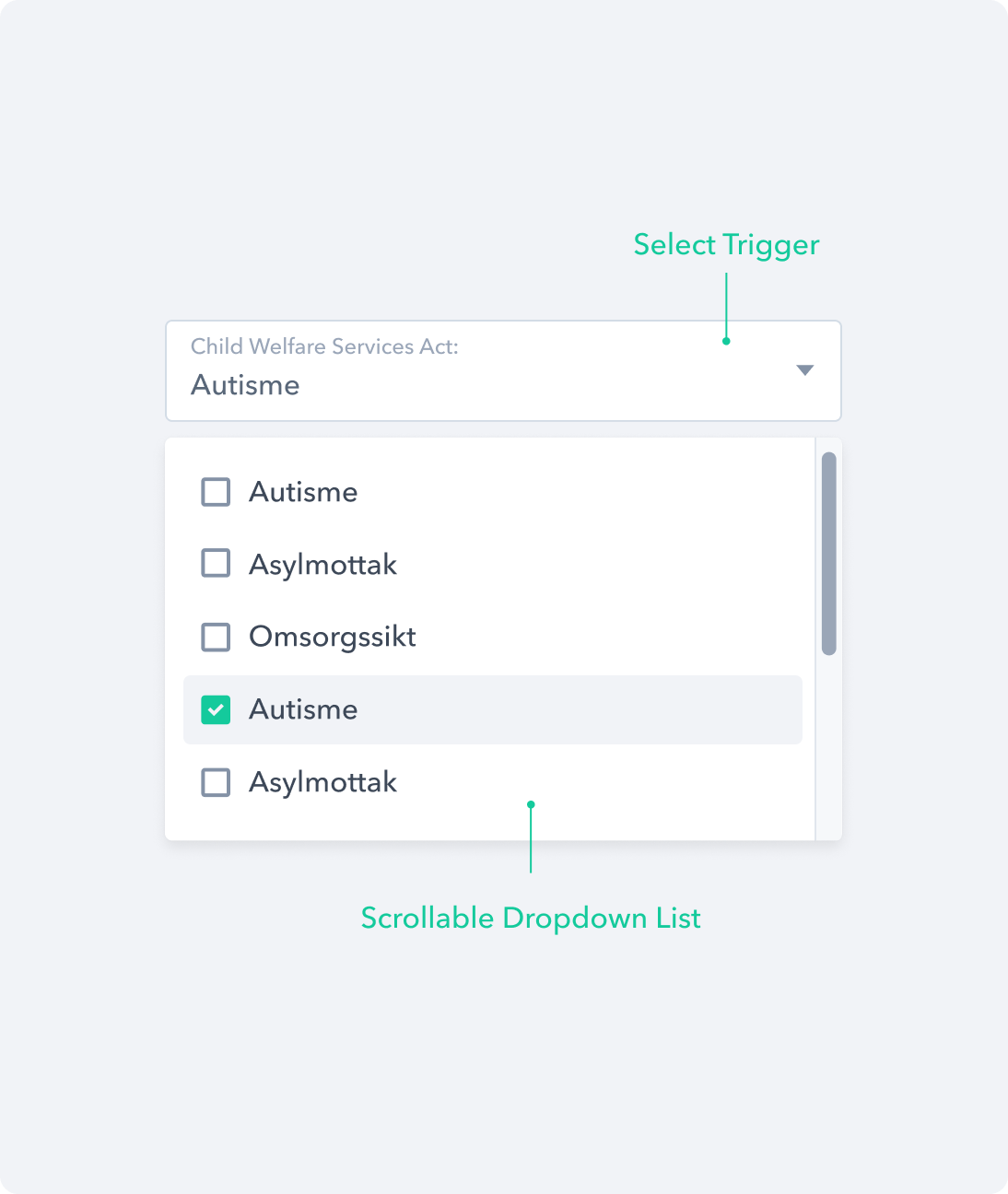
The Single Select component that lets the user choose one option from the options menu.
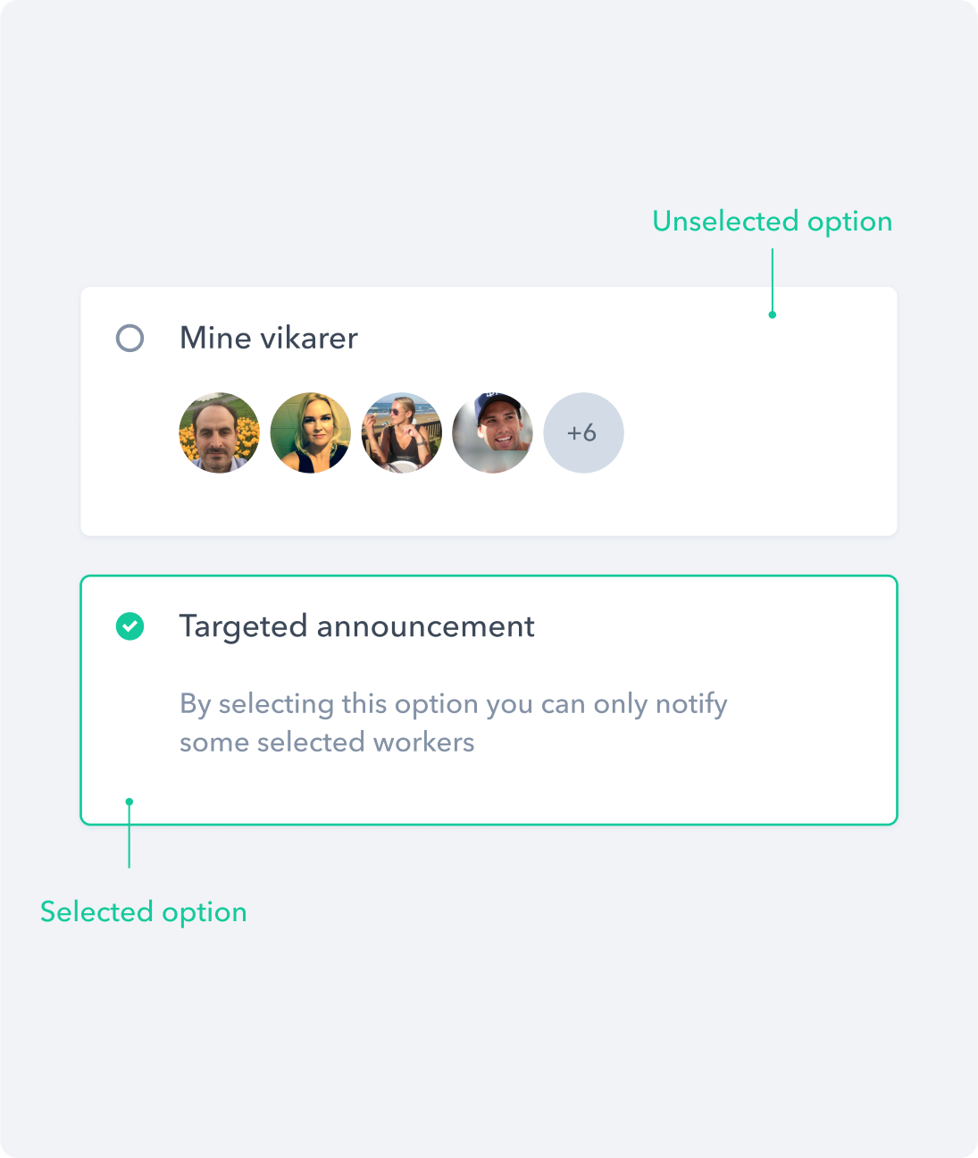
The selection card component that displays as an alternate style variation for checkboxes and radio buttons.
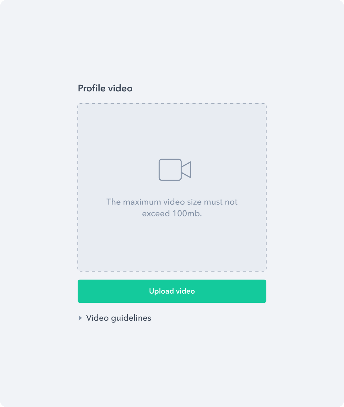
The upload component that allows users to upload one video presentation file.
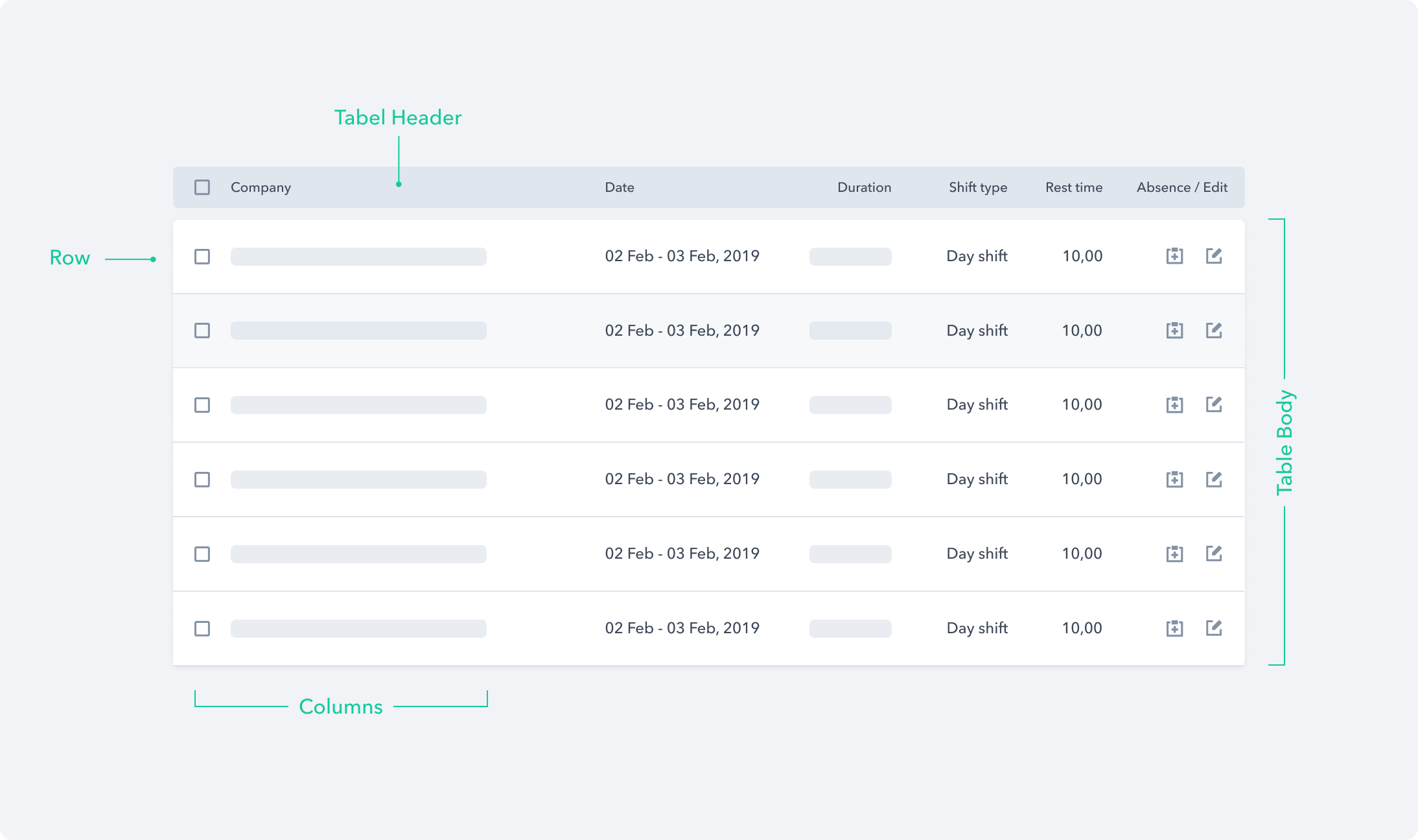
Data Display
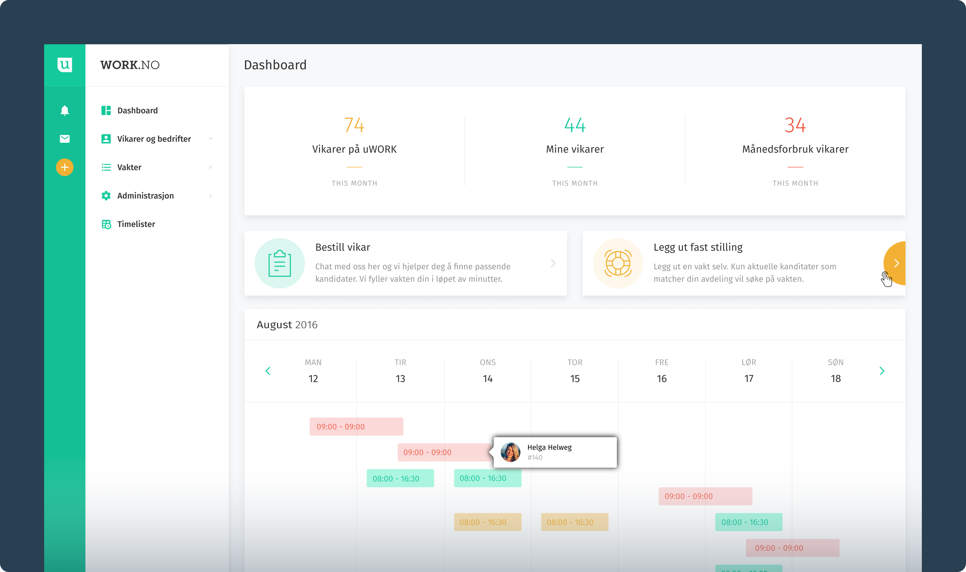
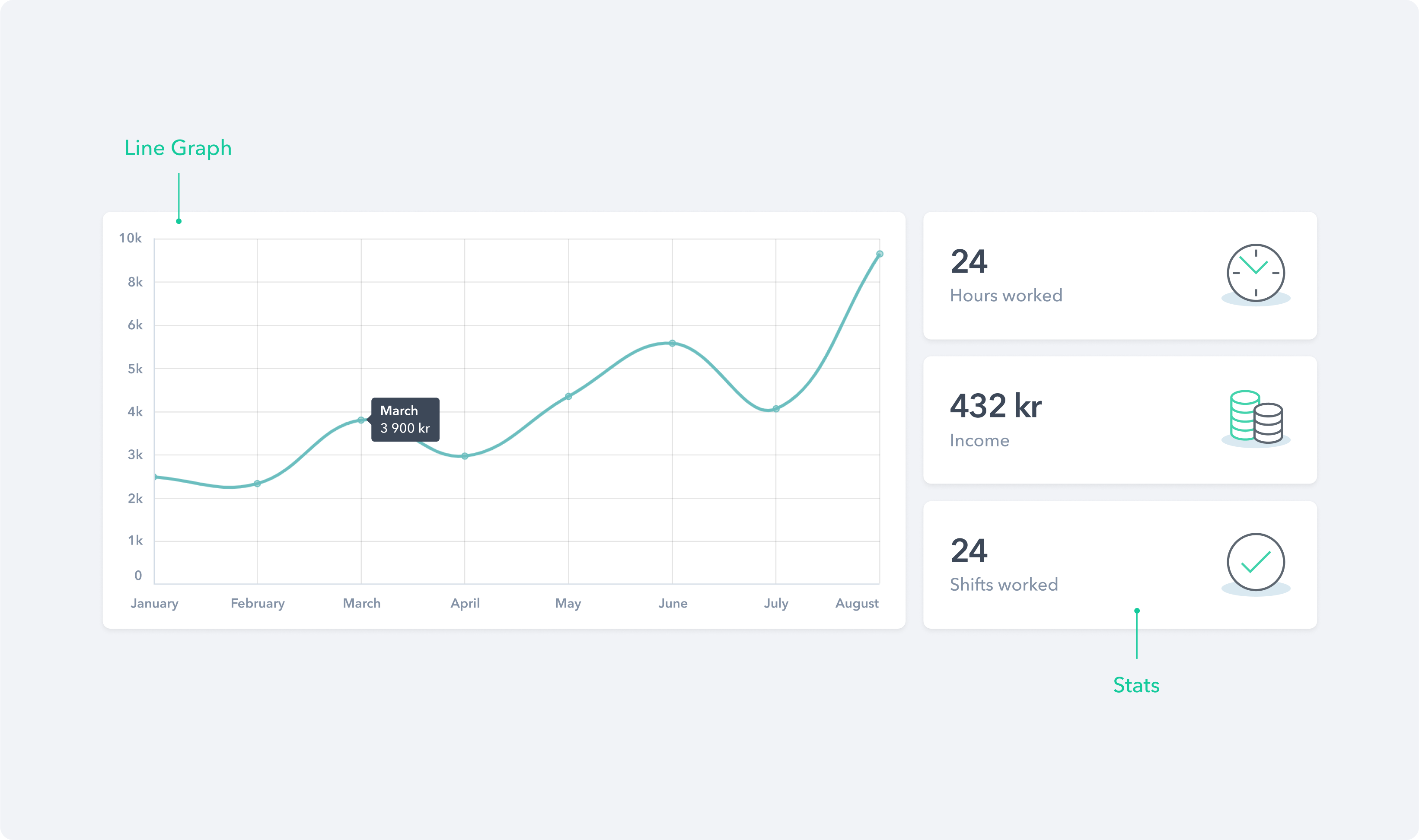
Various types of Data Display components were designed to transform raw data into an intuitive and visually appealing format. These components encompass a wide spectrum of functionalities, ranging from the dynamic Calendar, which simplifies shift management, to the powerful Search & Filter component, enabling users to refine their data queries effortlessly.
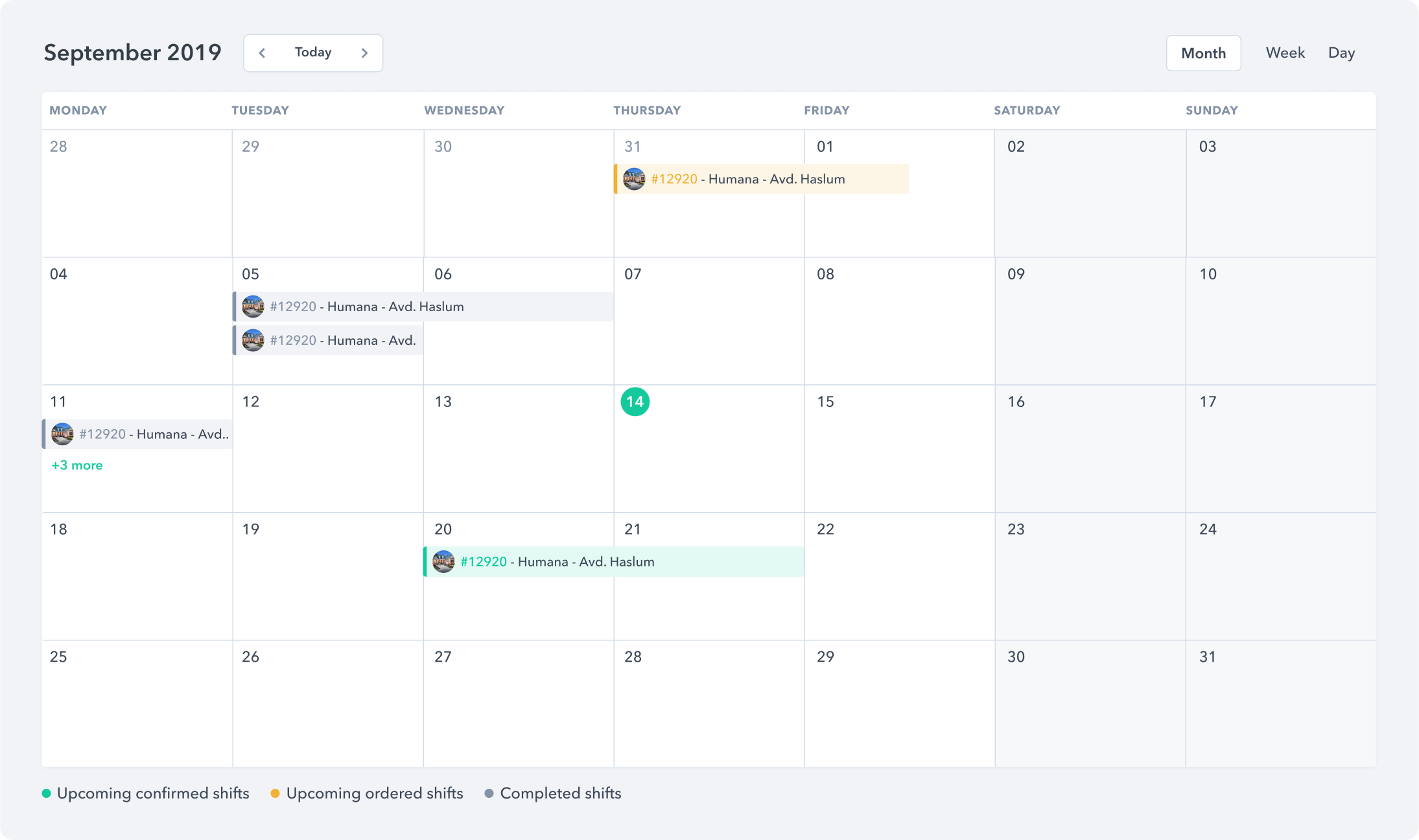
A calendar component that is used to display upcoming, ongoing and completed shifts in month view.
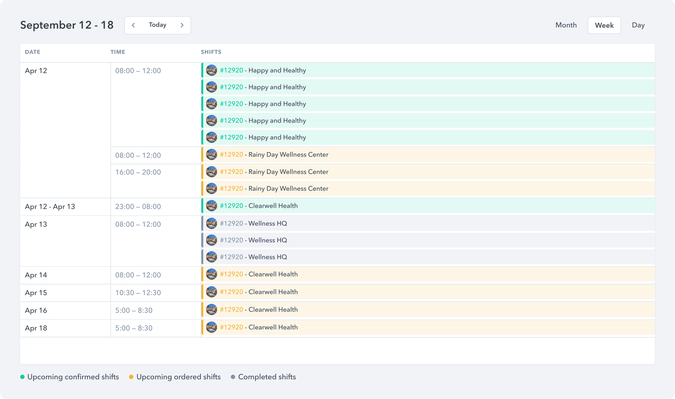
A calendar component that is used to display upcoming, ongoing and completed shifts in week view.
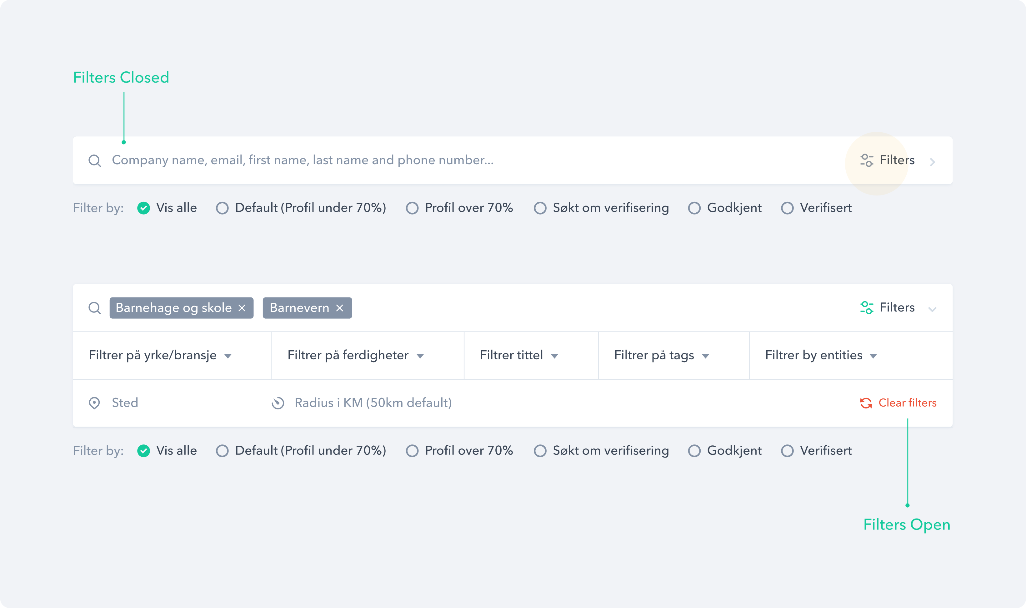
A search filter component that allows users to narrow down and refine the content displayed from the database.
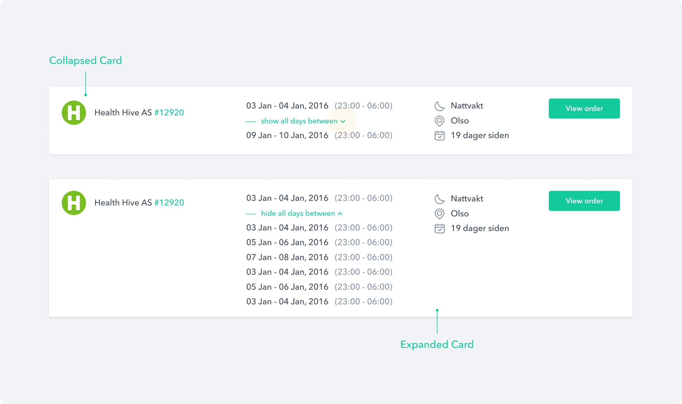
A collapsible card component that can reveal additional content by collapsing or expanding it.
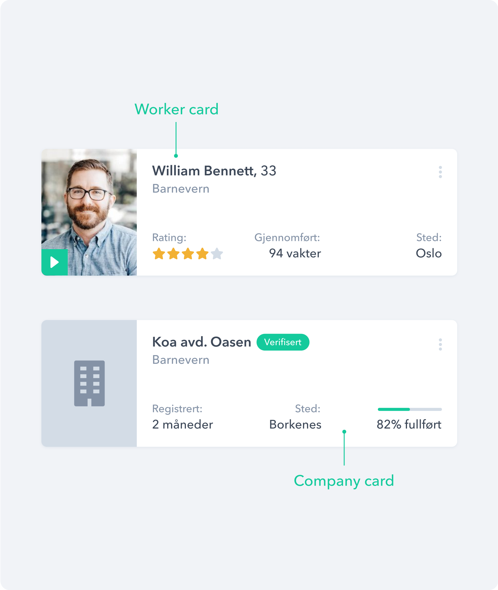
Card component
A List component that groups together a collection of similar or related items.
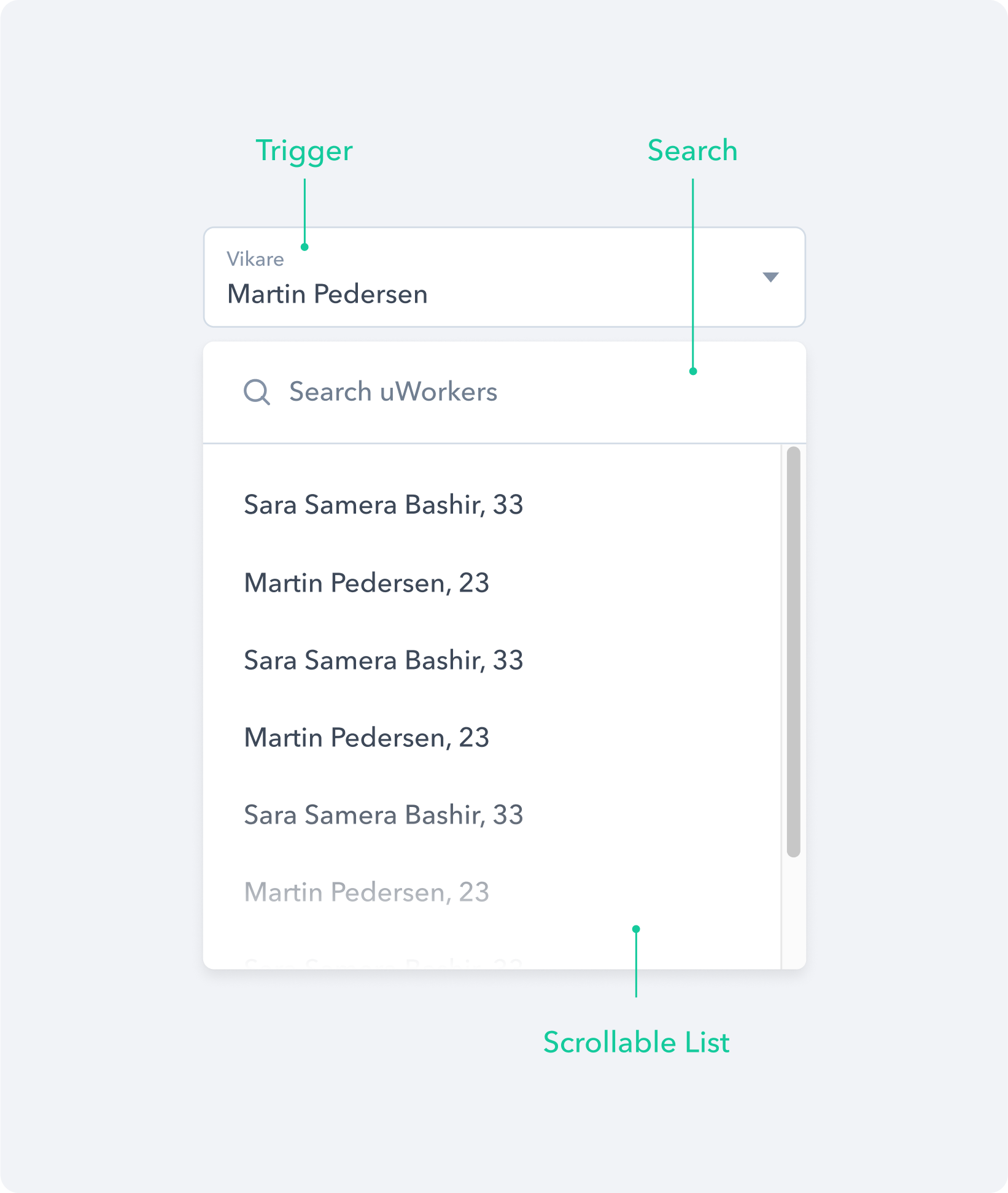
A dropdown component with search functionality that enables users to quickly find and filter options.
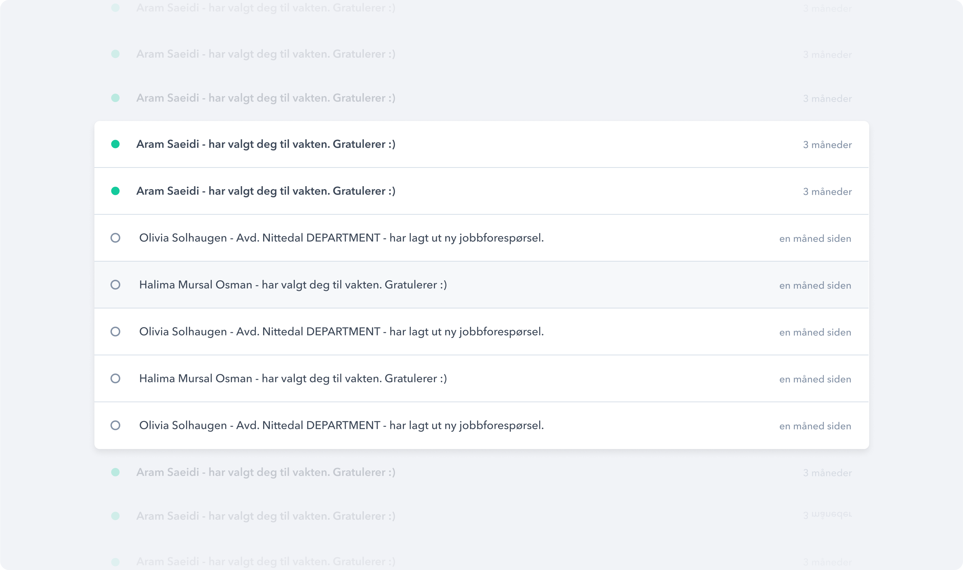
Feedback
In order to help users understand what the application is doing when they interact with the platform, we designed different components to feedback information or results.
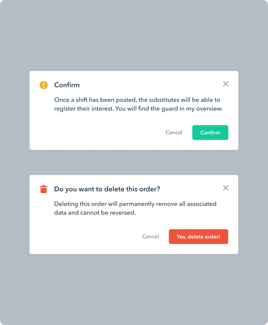
A dialog component that appears at the center of the page in response to a user action.
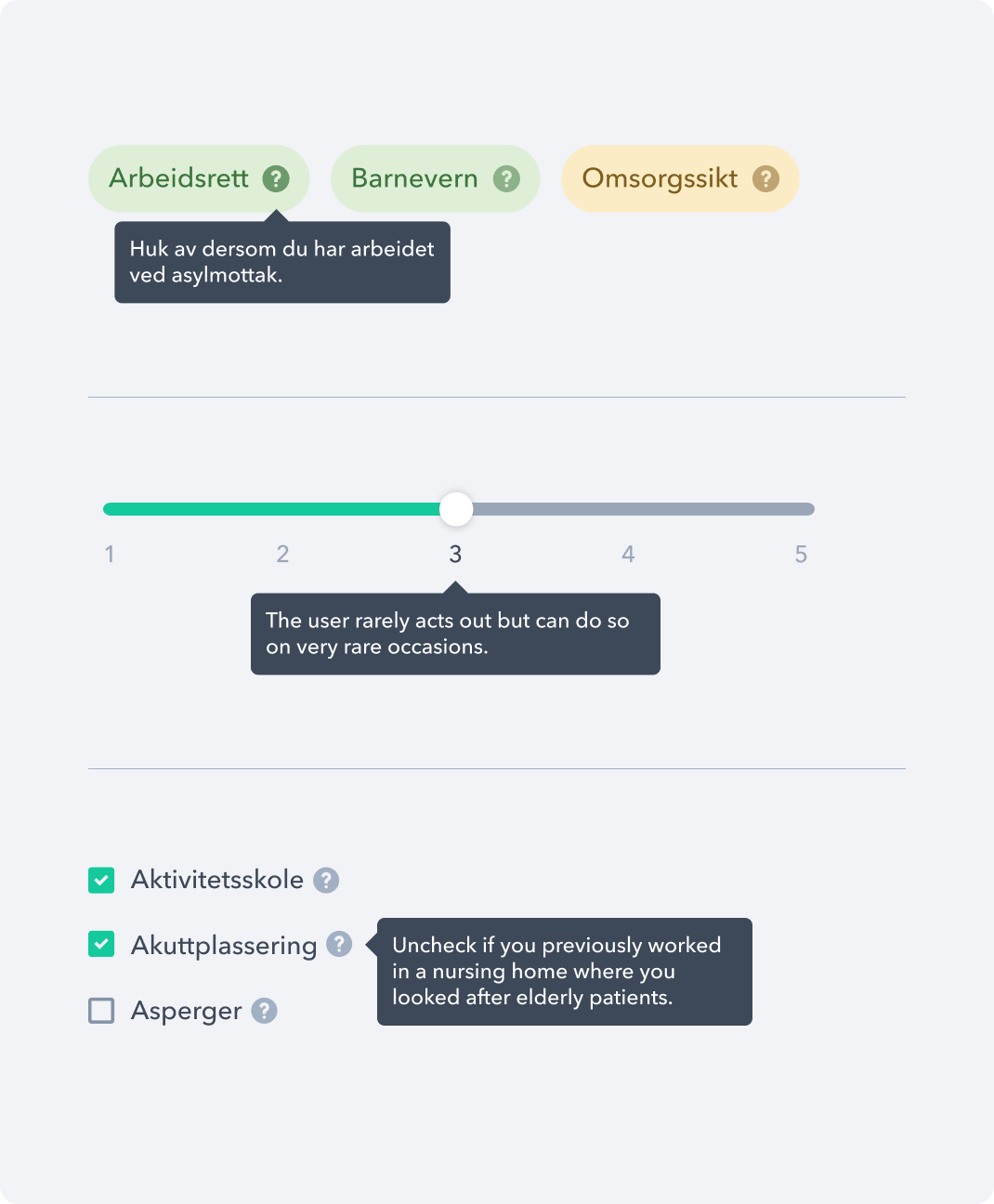
A tooltip component that is used to accurately describe the pointed object, such as icons, sliders, links, etc.
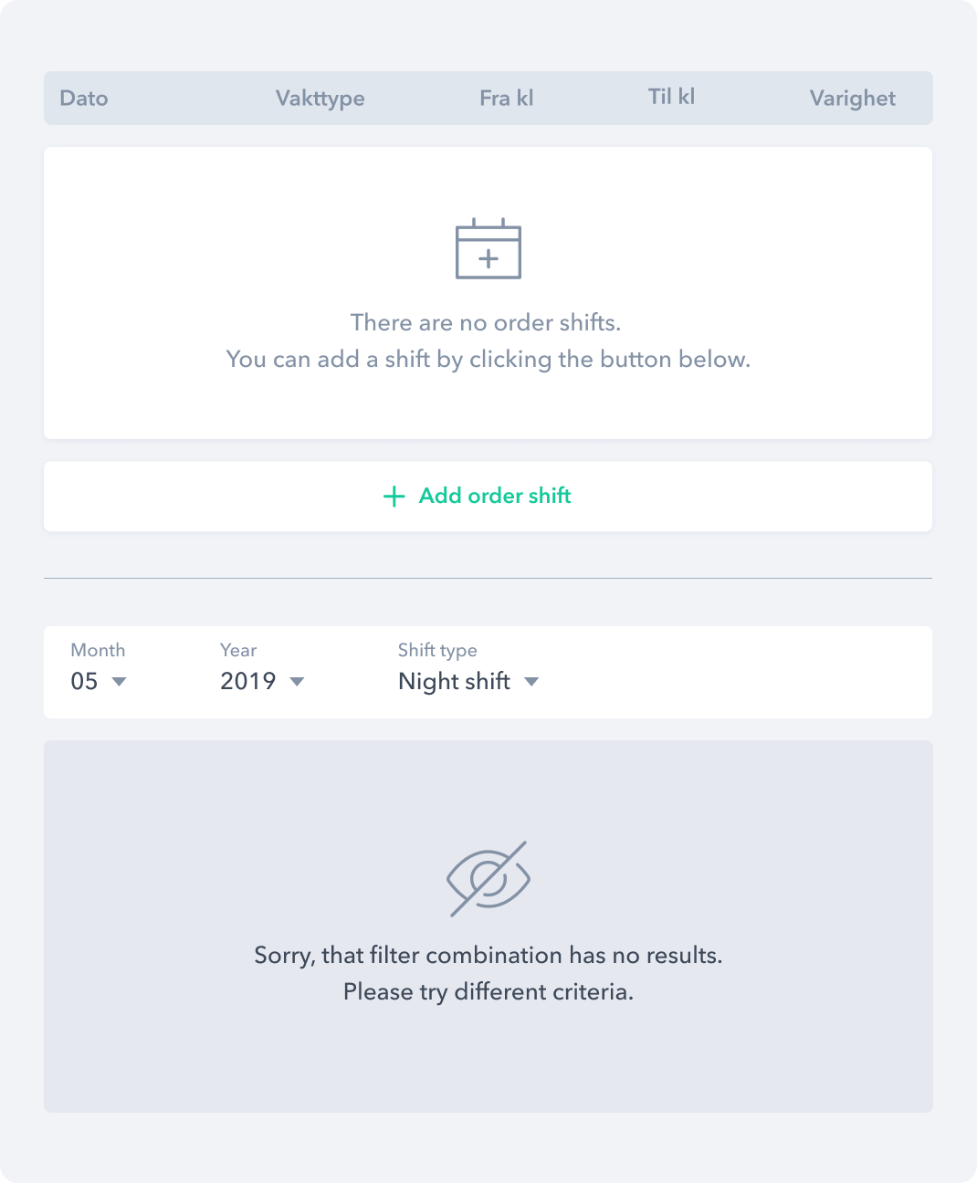
An infostate component that is used as a placeholder for any type of empty content.
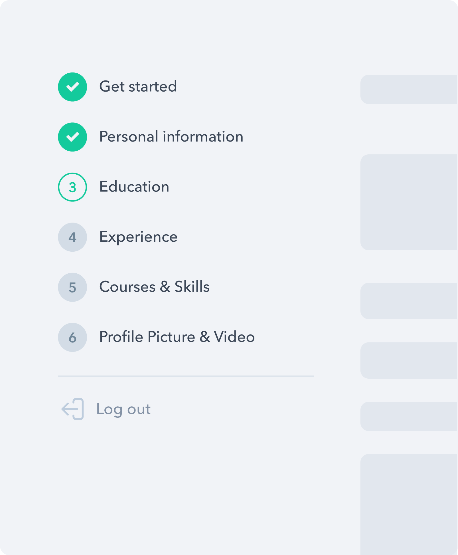
Onboarding
To reduce sign-up abandonment rates we have divided the process into multiple steps and in every step have included a progress bar so that users feel like they’re making progress and getting closer to completing their goal.
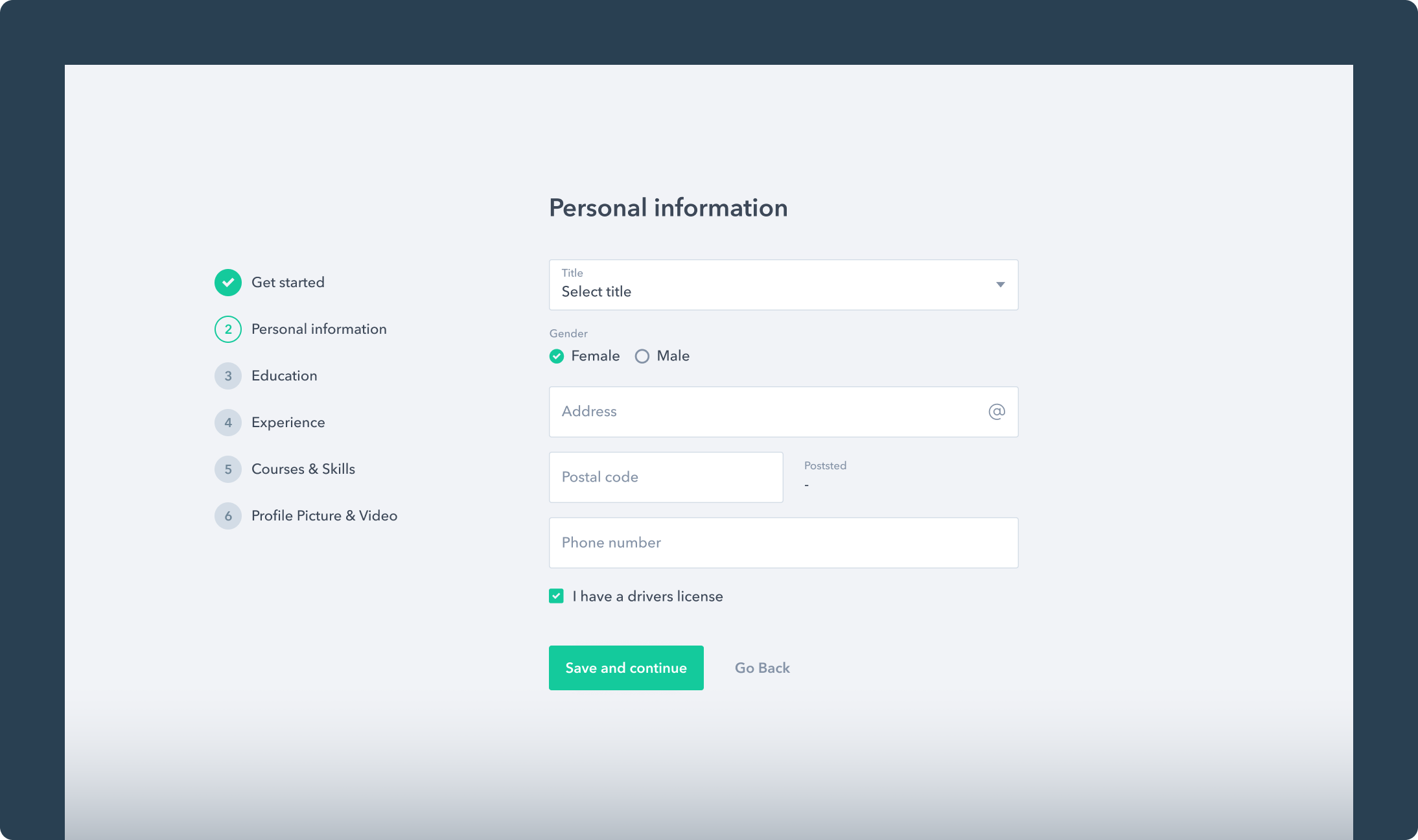
Personal Information
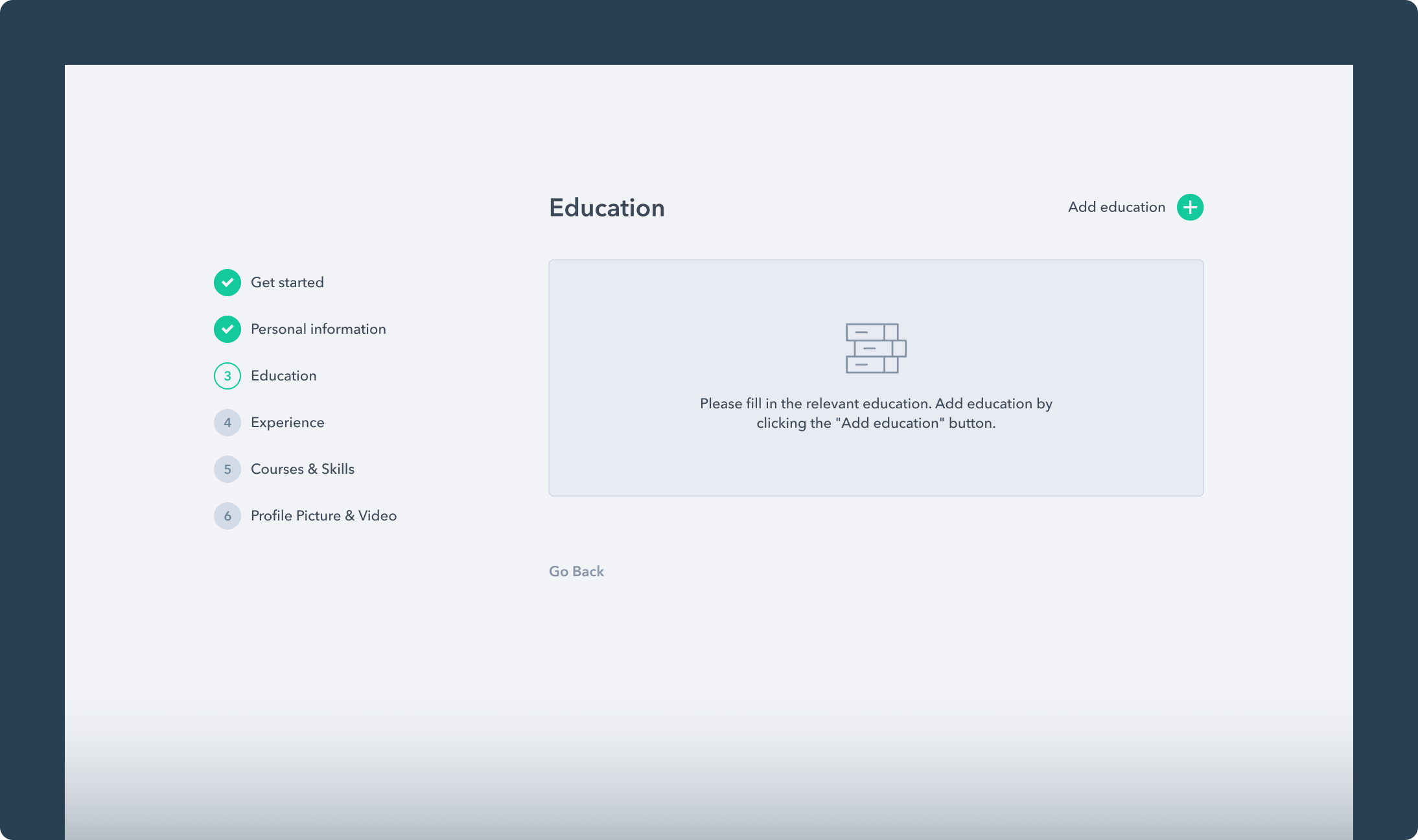
Empty Education
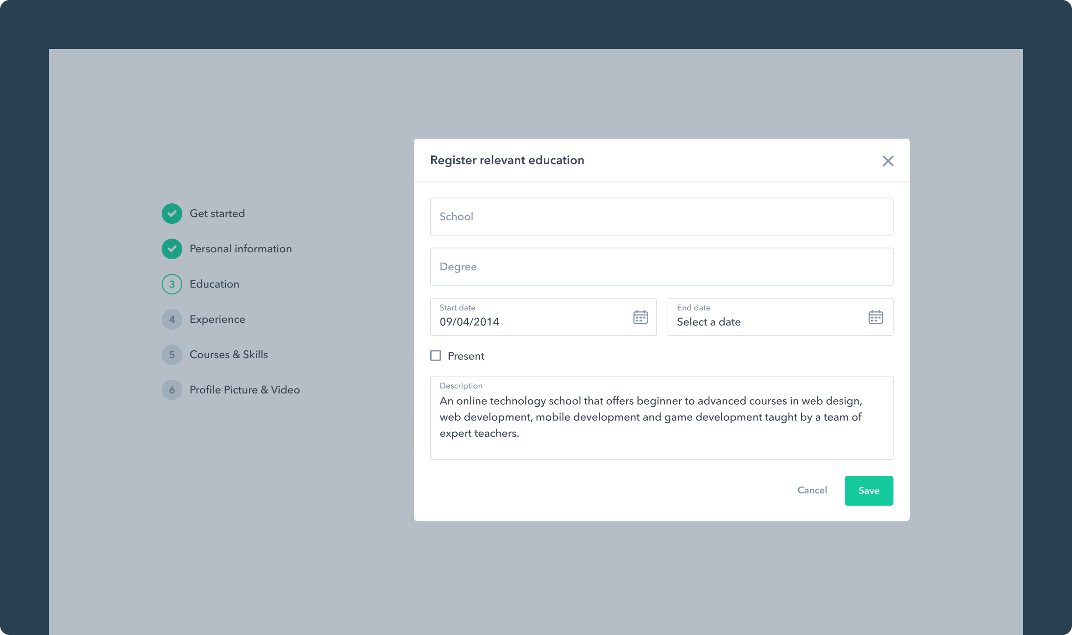
Register Education
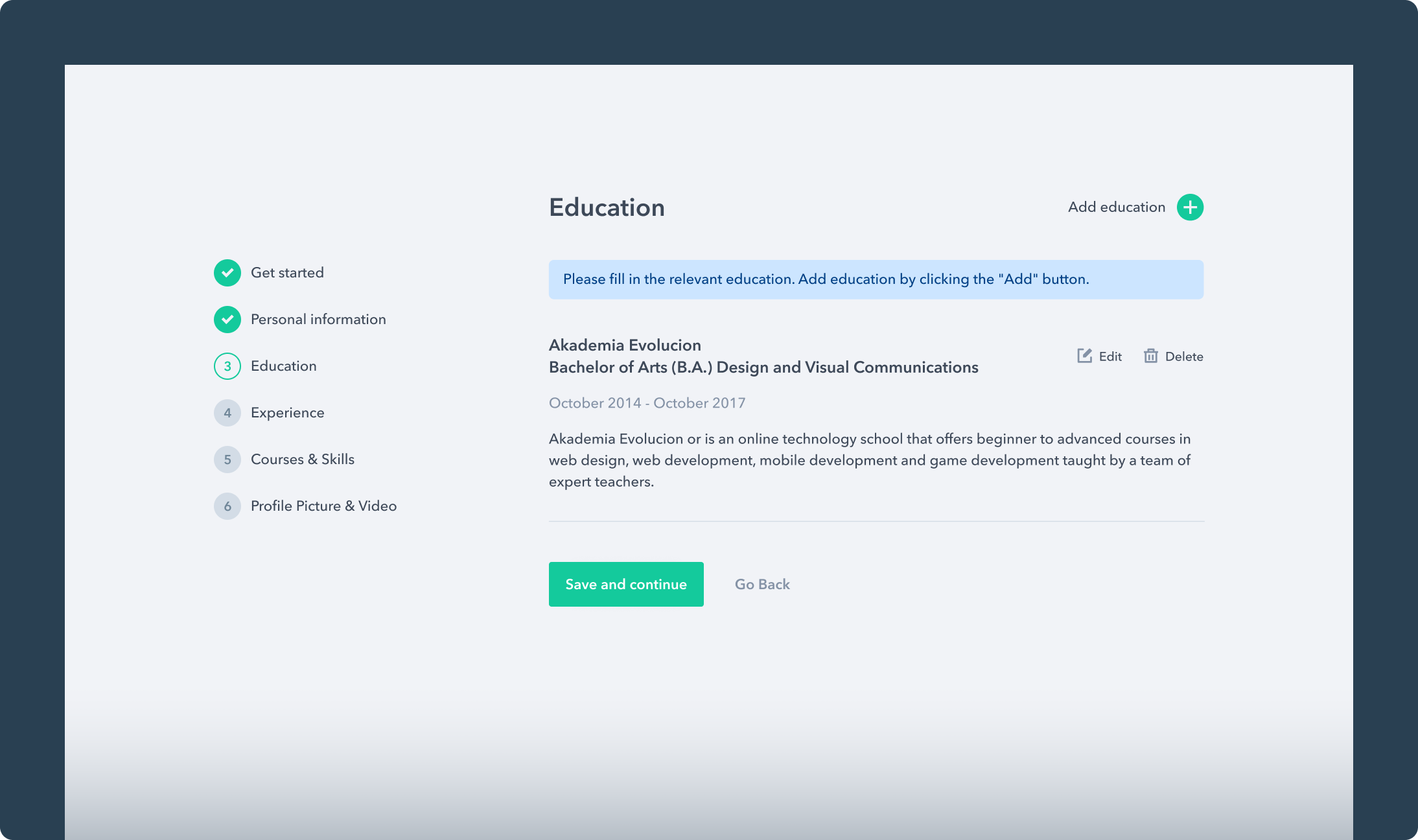
Registered Education
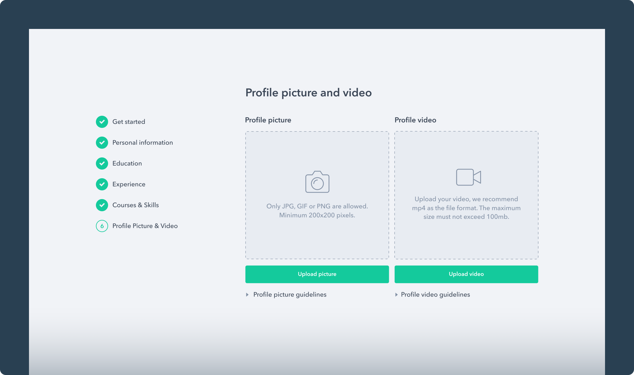
Profile Picture and Video Presentation
Email Templates & Newsletter
As registration is a crucial part of any web application, to complete the process, emails are required to aid communication with the users. We designed different email templates that are sent to them when they successfully create an account, request to reset a password, receive an invitation, etc.
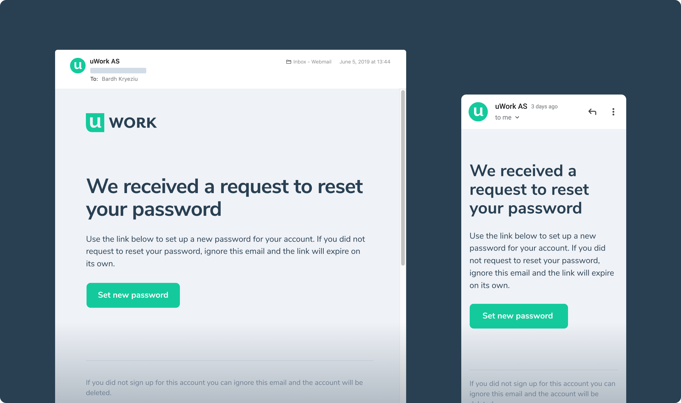
Password Reset
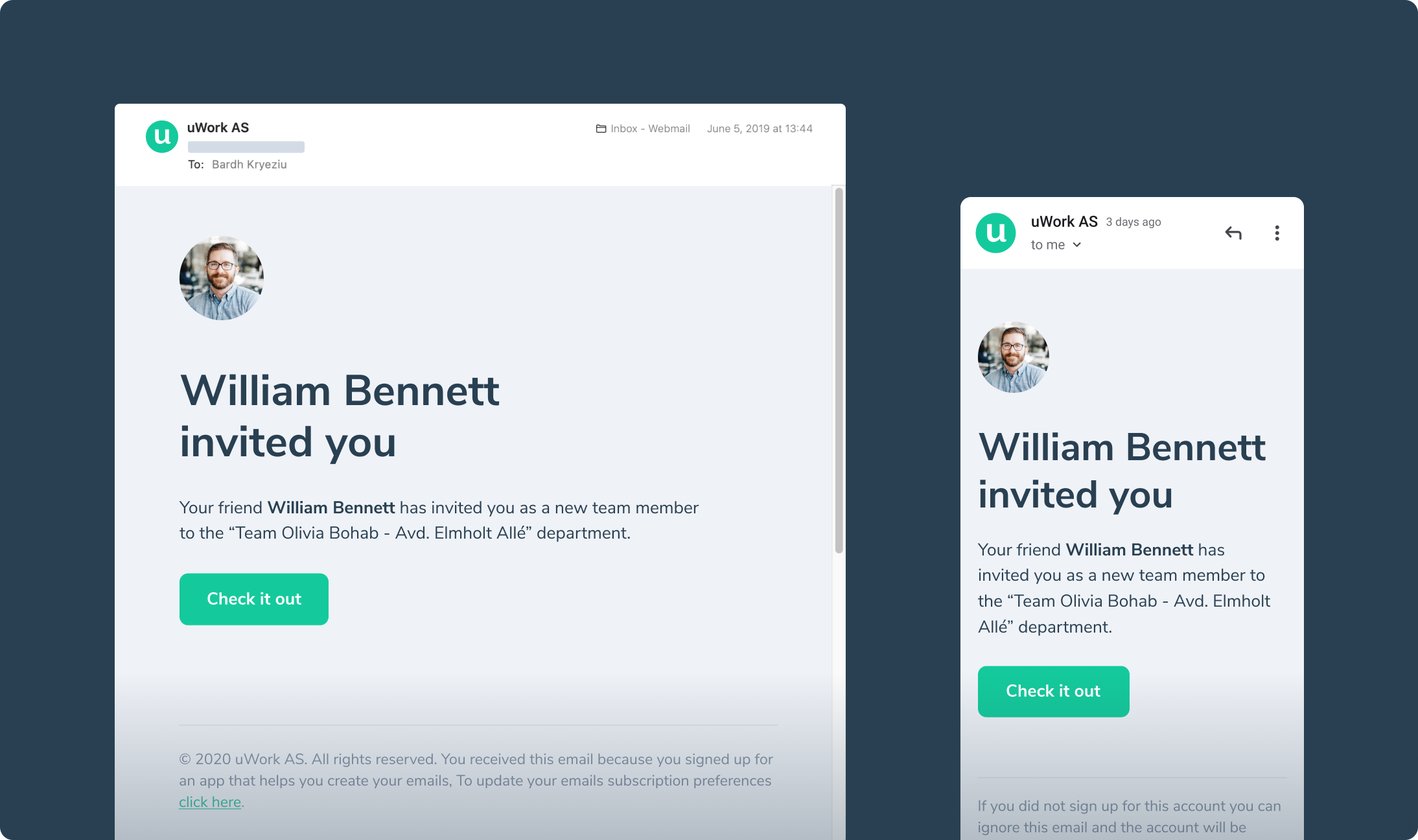
User Invitation
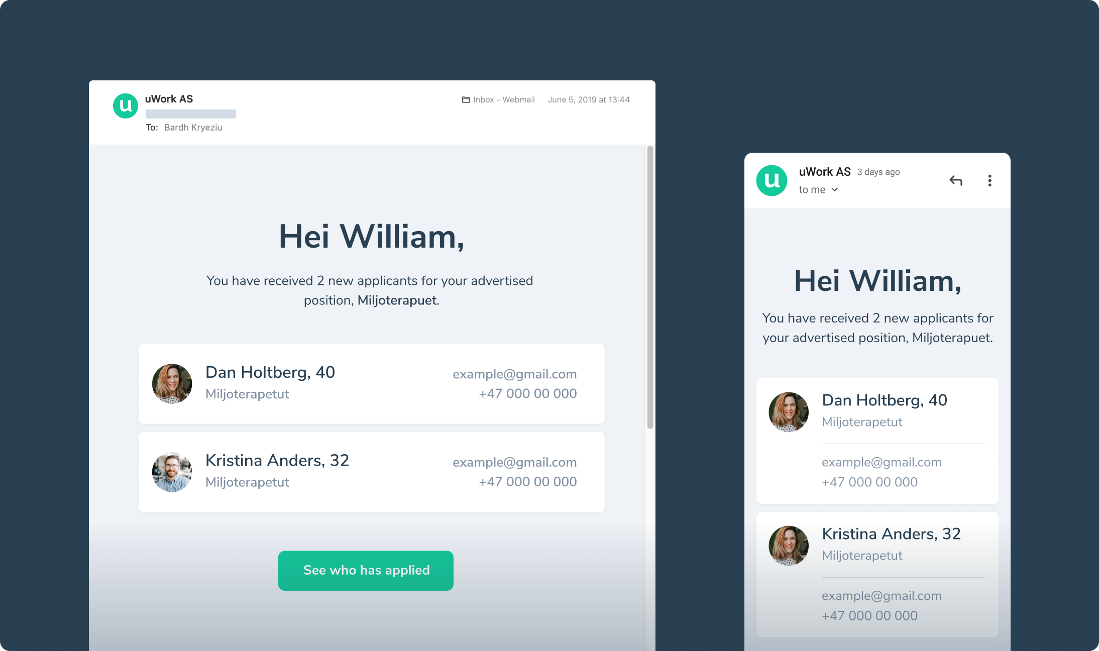
New Applicants
Pages
For such a data-heavy platform, keeping it clean was unconditionally fundamental. Every page needed to be carefully thought out and put in place. We avoided visual noises that could create even more chaos, focusing on the bare necessities.
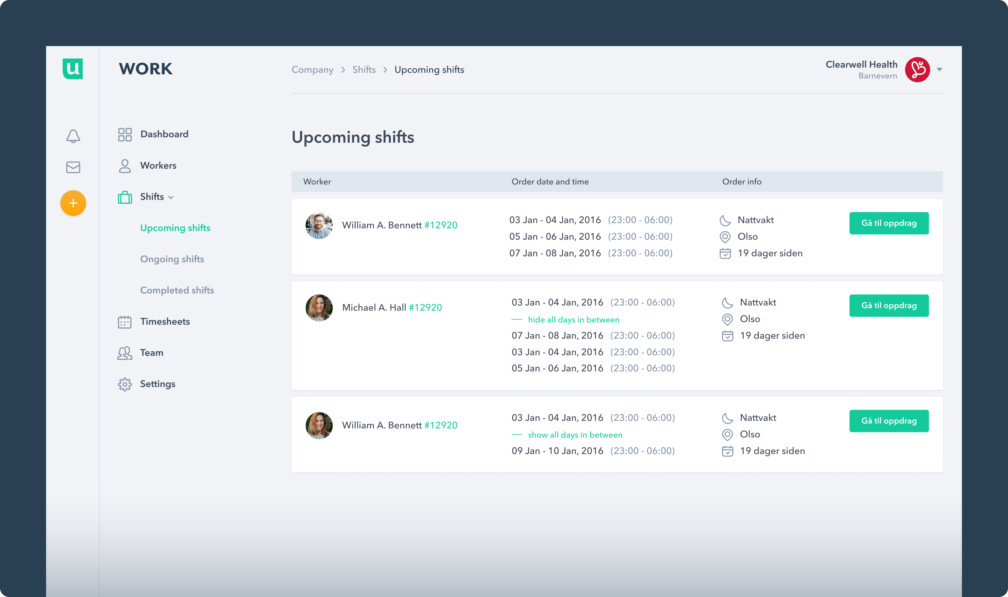
Upcoming Shifts
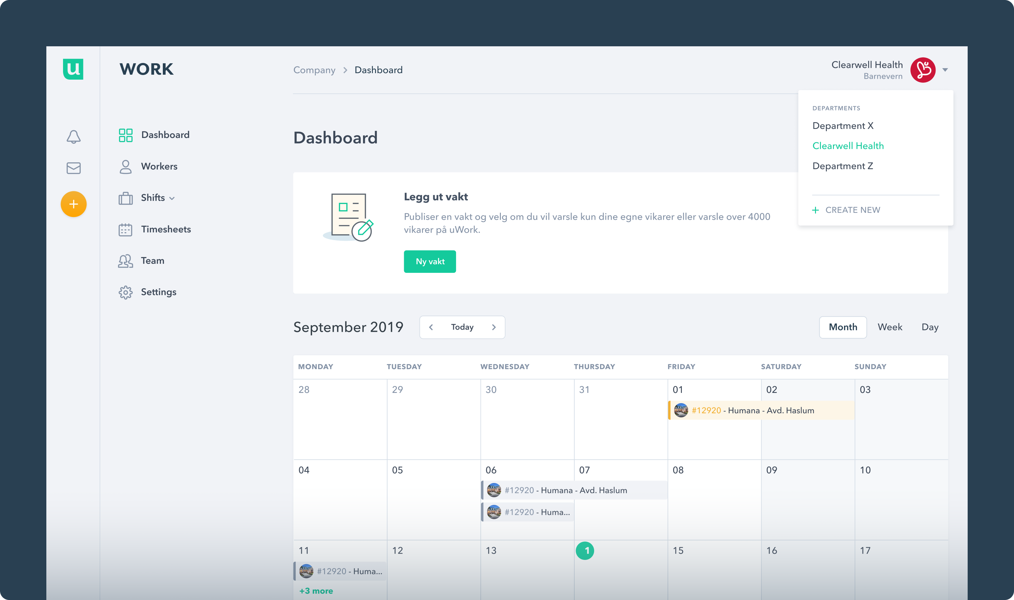
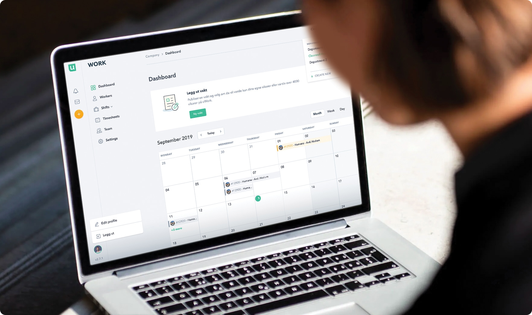
Dashboard
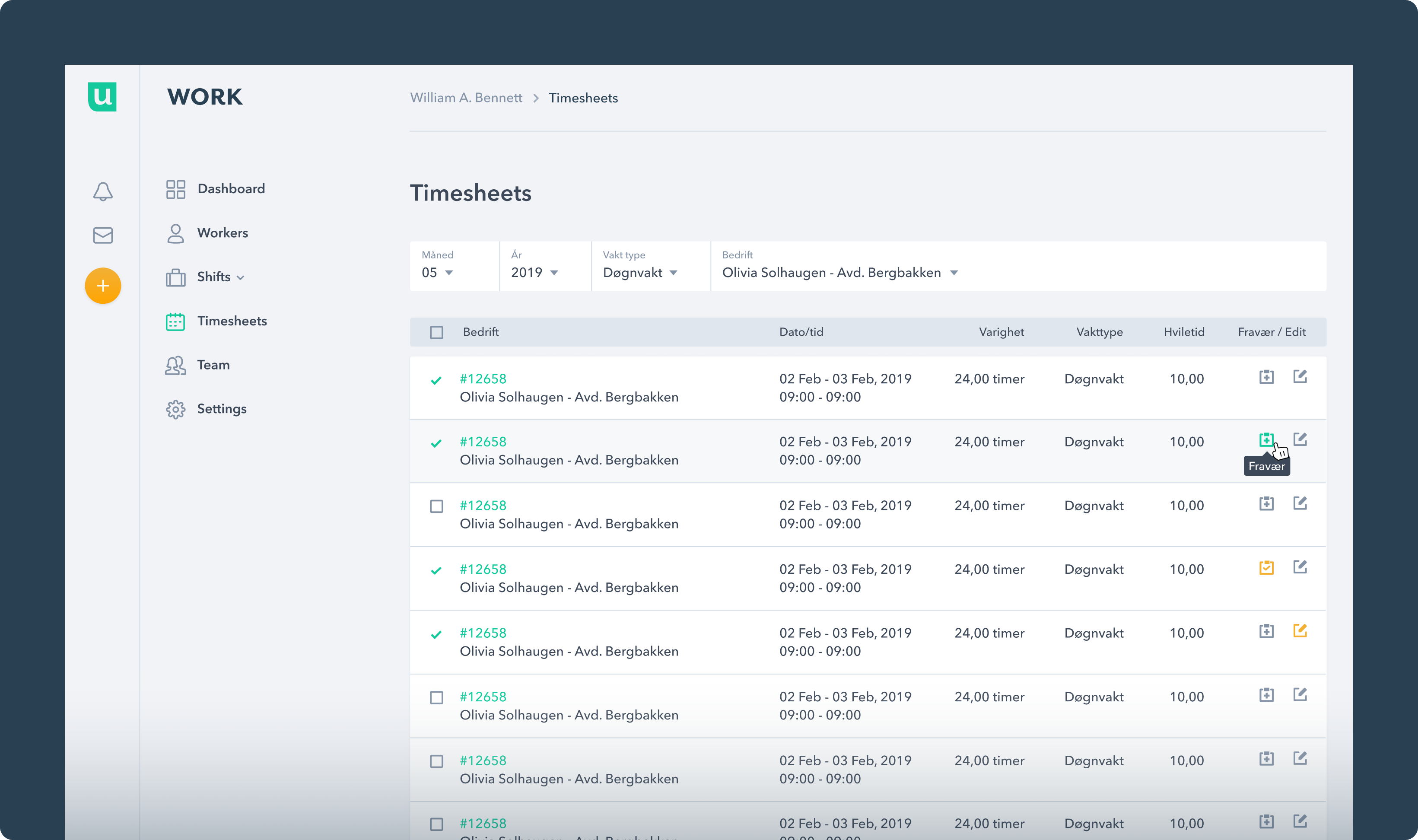
Timesheets
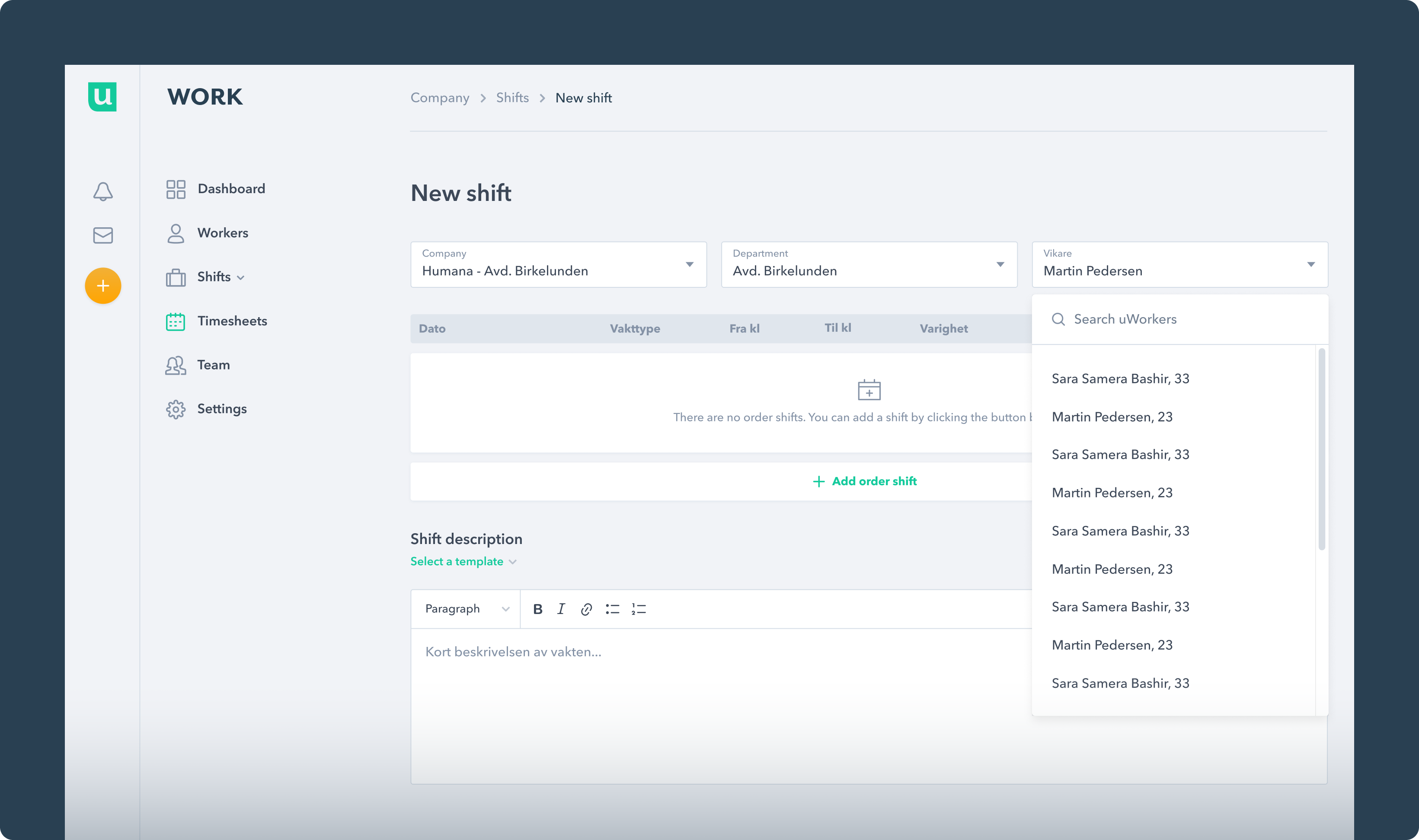
New Shift
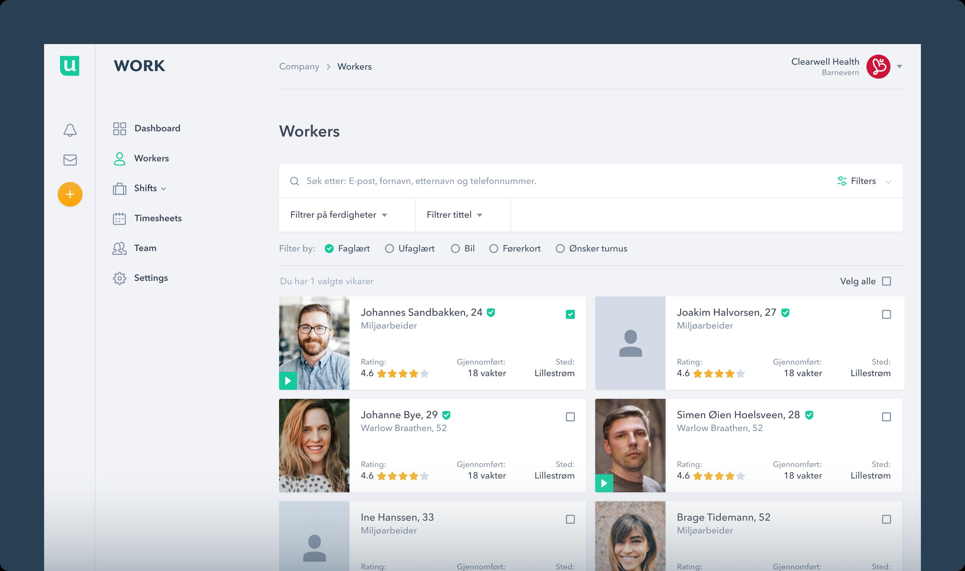
Workers
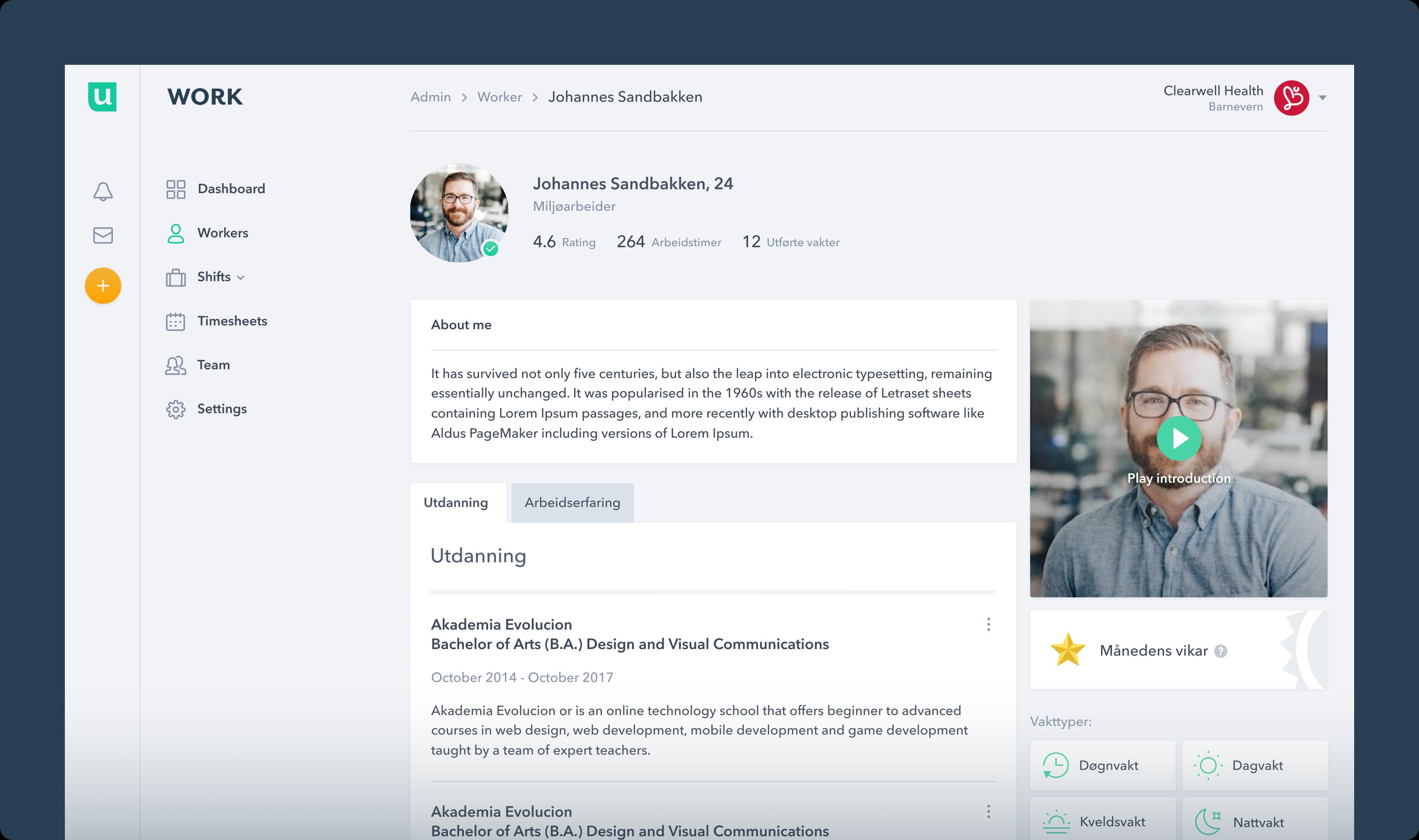
Worker Profile
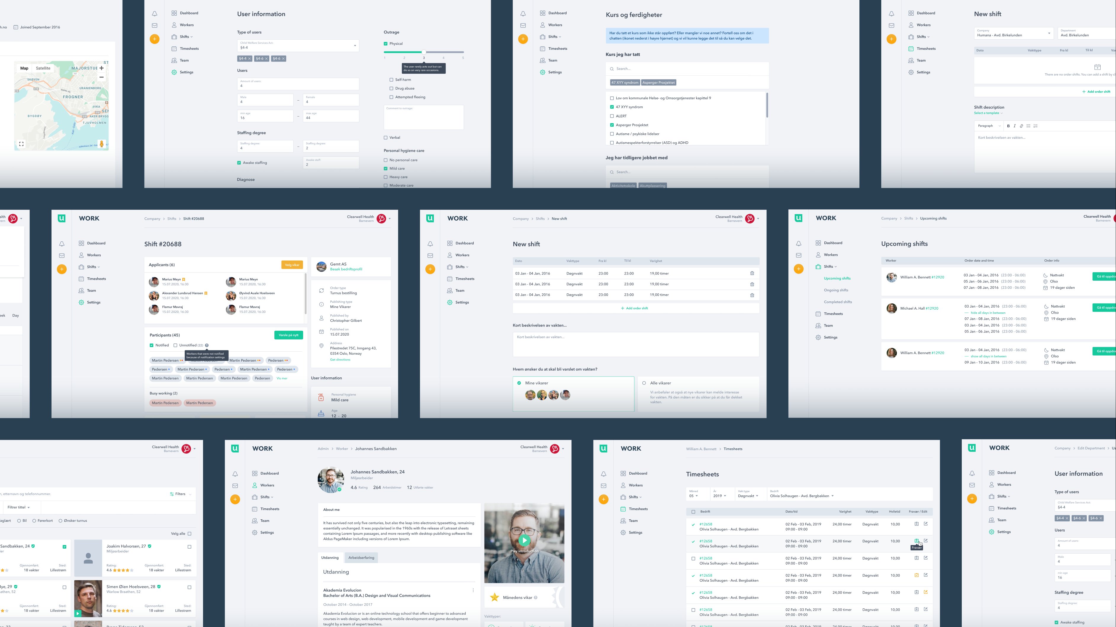
100+ Pages
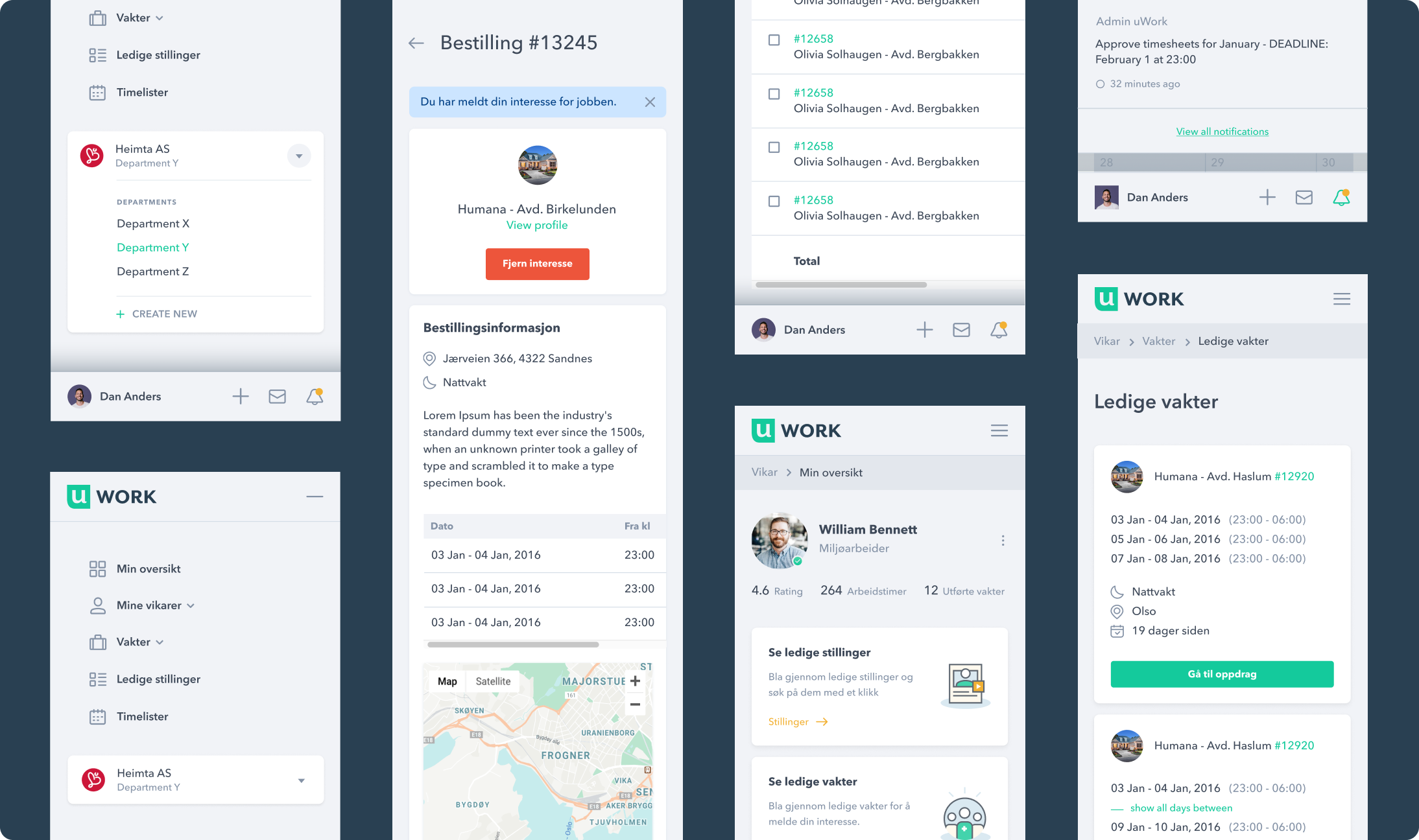
Responsive view
uWork offers a native app for workers, while the platform is also optimized for responsive viewing, ensuring accessibility from any device for both companies and administrators.
Results
The web application redesign for uWork delivered substantial results, including increased user engagement, streamlined onboarding with lower sign-up abandonment, enhanced mobile accessibility, and positive user feedback.